Pfizer
A visual rebrand across all Pfizer platforms
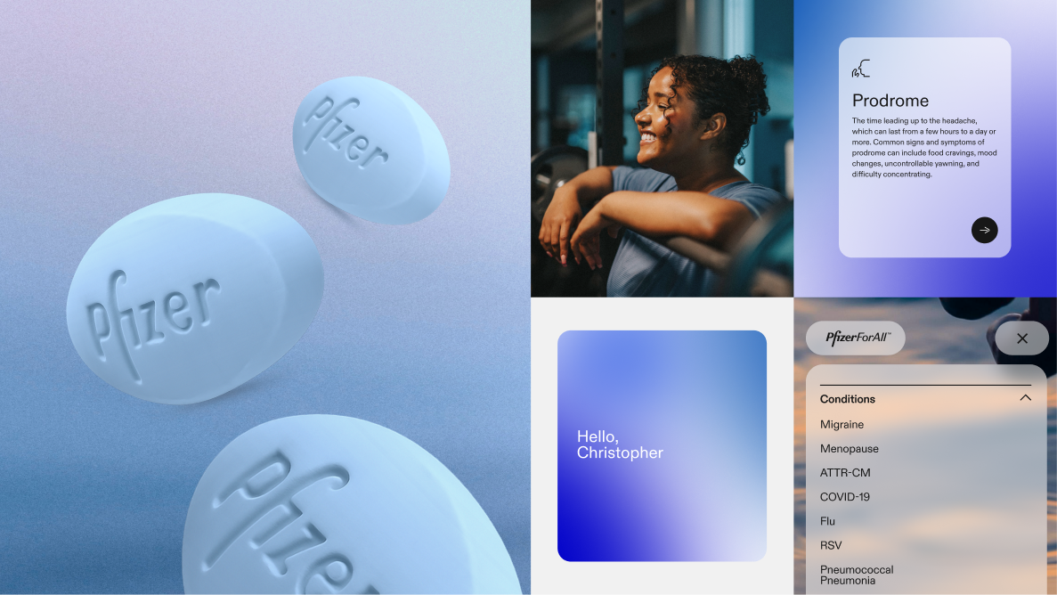
We were tasked to help lead the rebrand of the Pfizer ecosystem, unifying all their separate systems into a cohesive language. This work would guide the broader design ecosystem and the overall direction for PFA, for MVP and beyond. After we aligned on the design direction, we redid the UX/information architecture of the website and used it to redesign the entire PFA website refresh.
TEAM
Sharon Jia, Samuel Kim, Jim Kreher, Lizzie Calo
TIMELINE
6 months
MY ROLE
Visual Design, Motion
PROBLEM
Pfizer’s ecosystem and Zenith design system is disjointed and has many areas of opportunity.
We took this as a chance to give a visual refresh to the system as a whole and led an effort to rebrand the design system ecosystem for Pfizer as a whole. In particular, we explored microanimations and motion to bring a more premium and interactive feel to the experience, using subtle transitions, responsive interactions, and motion principles to create a more engaging, intuitive, and human-centered digital ecosystem.
PROCESS
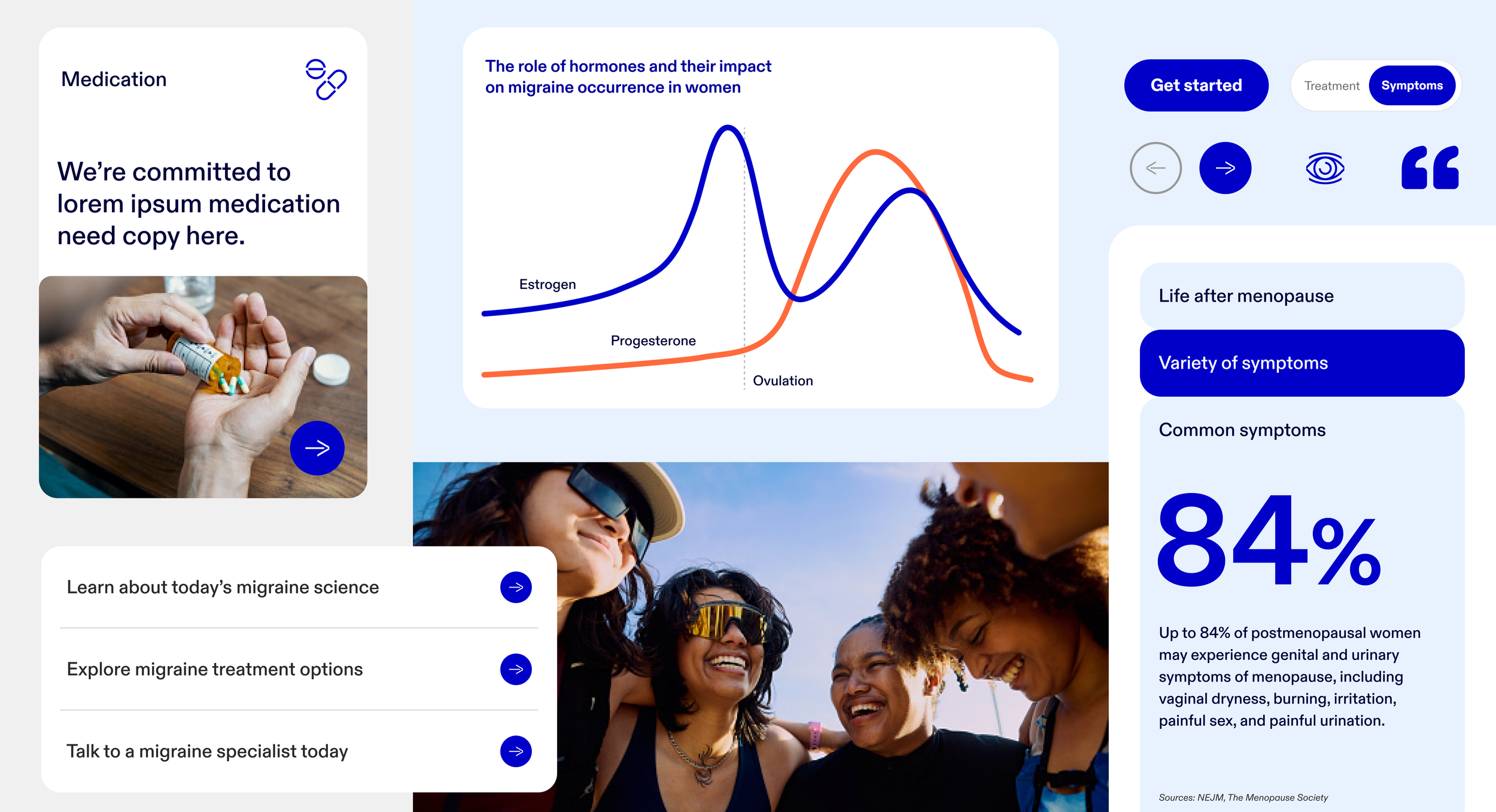
Developing three distinct visual directions to create a more expressive, human-centered Pfizer brand experience.
We captured visual and experiential elements (photography, motion, and art direction) to extend beyond components and convey the brand’s personality and emotion. We then worked with the clients to develop the new look and feel.
DIRECTION 1
The Invitation
A design system that takes on a more welcoming and conversational tone, featuring content that feels digestible, with cues that are actionable. A frictionless system that leads to a friendly experience.

DIRECTION 2
The Spark
A direction that translates boldness into vibrancy and energy that injects optimism and magnetism into an equally all-human and relatable art direction.

DIRECTION 3
The Evolution
Inspired by Pfizer today, this design system strips down Brand 2.0 principles to a simpler, clearer, and calmer territory, where action declutters the moment for every visitor.


OUTCOME