OVERVIEW
Goldman Sachs’ first rebrand in 40 years
Delivering the excellence of GS through a remarkable digital experience that’s compelling and modern, highlighting the brand as a leader in the financial industry and beyond.
OVERVIEW
How might we create an emotive, engaging, and elevated experience that humanizes the firm?
As an Experience Design consultant for Goldman Sachs, our team was tasked with redesigning the entire GS ecosystem as part of their first visual rebrand in 40 years. While Goldman Sach’s reputation is well-known, their digital experience, like many financial firms, is outdated. There was an opportunity to redesign their brand and adapt its strategy towards its digital channels to keep sales strong as its competitors are experiencing rapid digital transformation.
I worked as a UX designer on both the GS.com and Personal Wealth Management websites. I specifically designed the wireframes for the Investor Relations and 155 Years of Excellence pages on GS.com, and the Advisor Landing page for PWM. I also led the prototyping and motion design for the homepage, including conceptual future-state motion design. Lastly, I spearheaded the motion design system for One Goldman Sachs.
TEAM
Sharon Jia, Chris Owyang, Steven Leong, Stephen Rose, Sarah Lou Benjamin, Rachel Lovinger, Dean Gianmarco, Elly Belden, Gemma Gordon-Gibson, Client Team from Goldman Sachs
TOOLS
Figma
TIMELINE
1 year
MY ROLE
UX Design, Visual Design, Research Analysis, Motion Design
PROJECT OVERVIEW
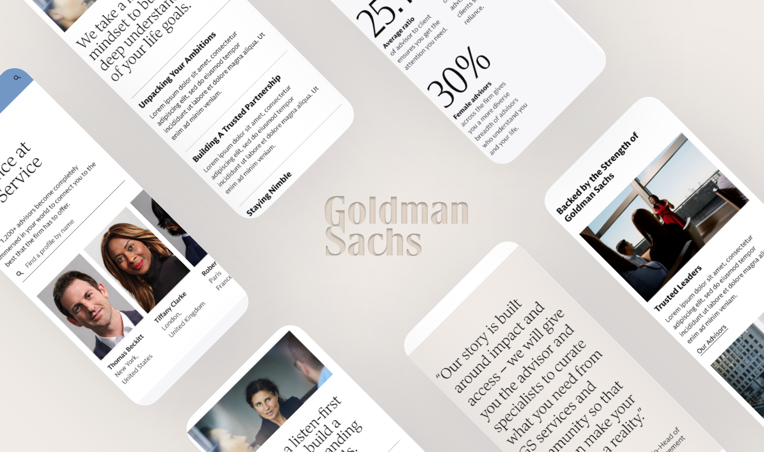
A net-new private wealth management advisor page
Designing an advisor page for the Private Wealth Management website to create a more human-centric and emotionally engaging digital presence to drive customer acquisition.
With the new One Goldman Sachs rebrand, we were asked to redesign their Private Wealth Management (PWM) website. While Goldman Sachs had established itself as an industry leader, its online presence lacked the emotional connection and human-centric experience that would help it stand out in the increasingly digital financial services market.
The goal was to transform the PWM website into a digital presence that wasn't just informative but also personalized and emotive. Since many users have already done their research prior to coming to the site, we focused particularly on how the firm communicated its values, cultural fit, and the human side of its advisory services to create increased emotional engagement.
Thus, we designed a new advisor page to highlight the real people at the firm and drive emotional connection—critical for establishing cultural fit and trust at this stage. We used a narrative-driven approach to humanize the firm, ultimately fostering the trust and connected needed to drive customer aquisition.
Objective
Our vision was to help Goldman Sachs redefine the digital experience of Private Wealth Management by humanizing the firm. We aimed to transform the website into a personalized, emotive experience that would not only address the core functional needs of the site but also create an engaging and warm environment that would foster trust and relatability.
Solution
We designed a new Advisor Landing Page that highlighted the people of the firm and used narrative-based storytelling to cater towards the emotional decision-making process of potential clients, and ultimately drive customer aquisition.
PROBLEM
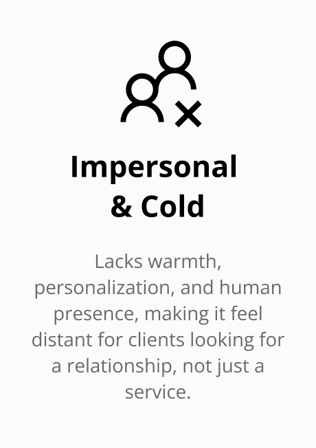
PWM currently fails to provide the emotional and human connection clients seek.
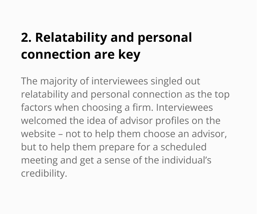
Clients visit firm websites primarily to assess cultural fit rather than conduct research, but there is a lack of emotional connection and little human presence in the current experience.
The most credible sources are the ones who know the client well: Interviewees cited parents, colleagues and friends as their go-to sources of information when choosing an advisor, on the basis that they would be able to bring their understanding of the individual’s personality and circumstances to the conversation. The website, as the subsequent step in their journey, plays a pivotal role in the more emotive validation process: clients told us they would visit the website once they had researched and shortlisted firms, to get a sense of relatability and cultural fit, rather than to do more tangible research.
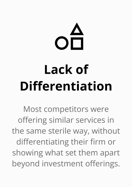
However, the PWM website currently does not showcase the emotional and human side of the firm, but instead, feels cold and impersonal, lacking the warmth and personalization clients seek in a trusted advisor. With no human presence—such as advisor profiles or personal stories—it was difficult for prospective clients to feel a connection with the firm. Unlike competitors who embraced emotive storytelling, the site relied on generic, dry facts, failing to reflect the emotional decision-making process of high-net-worth individuals.
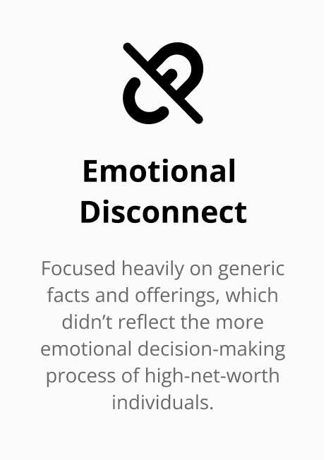
“The emotional part of the story is what’s missing. We need to do something that sparks curiosity, turns perceptions on their head and catches people’s eyes.”
SOLUTION
An emotive and elevated advisor page
Our vision was to help Goldman Sachs redefine the digital experience of Private Wealth Management by humanizing the firm and appeal to the emotional decision-making process of HNW clients. We aimed to transform the website into a personalized, emotive experience that would not only address the core functional and informational needs of the site, but also create an engaging and warm environment that would foster trust and relatability.
How might we create an emotive, engaging, and elevated experience for PWM that humanizes the firm to drive more lead captures with advisors?
SOLUTION
Key features
Humanizing the firm with advisors
Use advisor images and profiles to create a more emotive and engaging experience that allows potential clients to foster trust and reliability.
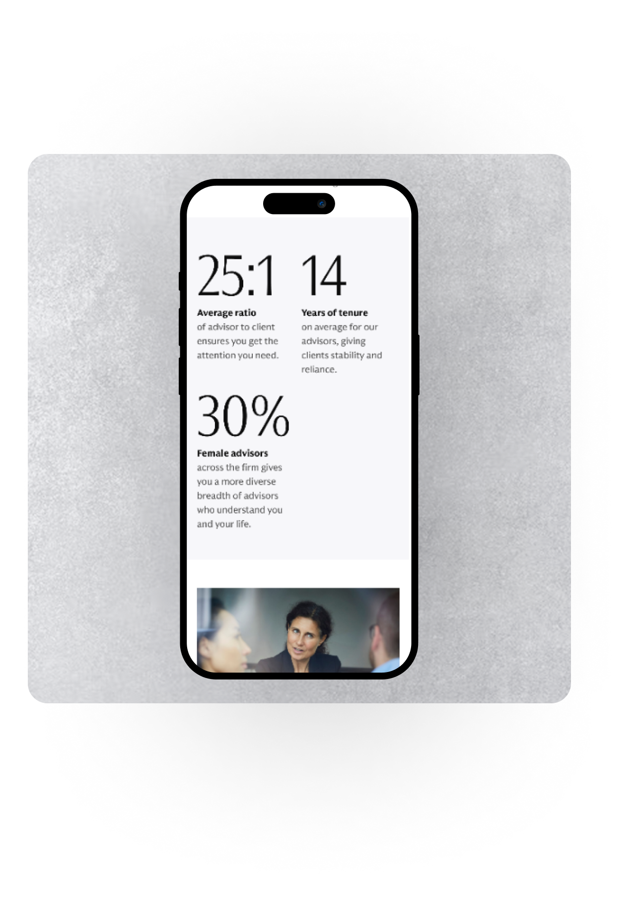
Highlighting differentiators from competitors
Using specific, differentiating statistics to distinctly show why Goldman Sachs is different from other firms, rather than providing the same generic language competitors use.
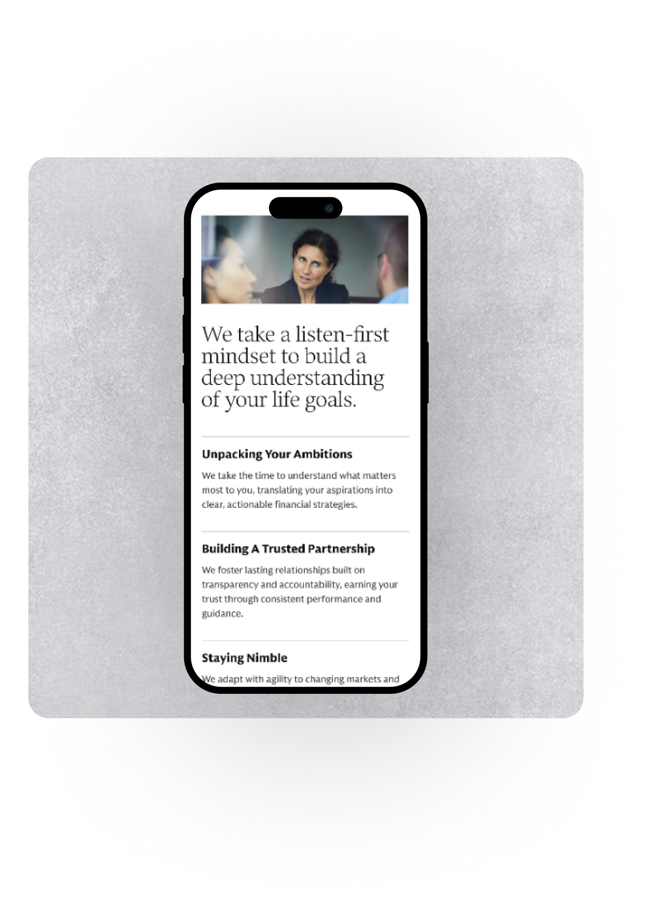
Narrative-driven storytelling
Show success stories and quotes from real clients to engage potential clients, allowing them to connect with the story and values of Goldman since they’ve already done the quantitative research.
“It should be flawless, elevated, it needs to sparkle, like walking into Dior or Chanel vs a mall department store.”
OUR APPROACH
Design process overview
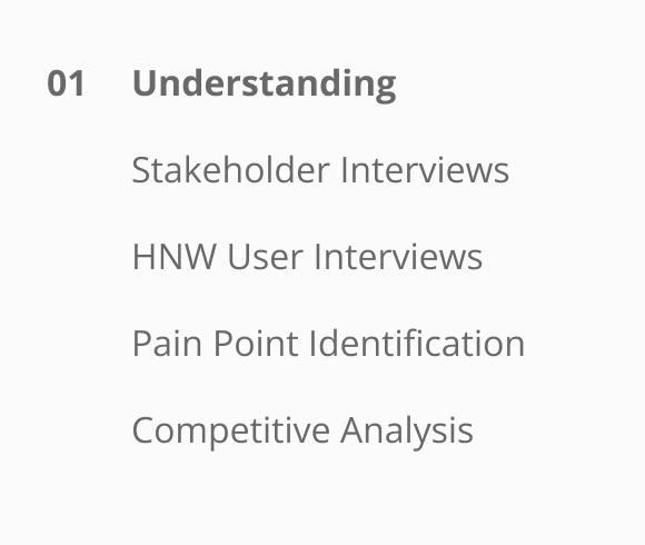
PHASE O1
Understanding
We began by interviewing 50+ PWM executives and 14 HNWI users to gain an understanding of how we can balance stakeholder objectives with user needs. We also assessed 240 webpages and >30 competitor experiences to identify current pain points.

Stakeholders interviewed

Competitors reviewed

Webpages accessed
INTERVIEW ANALYSIS
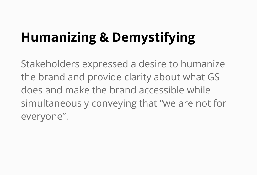
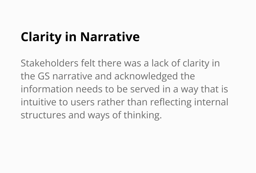
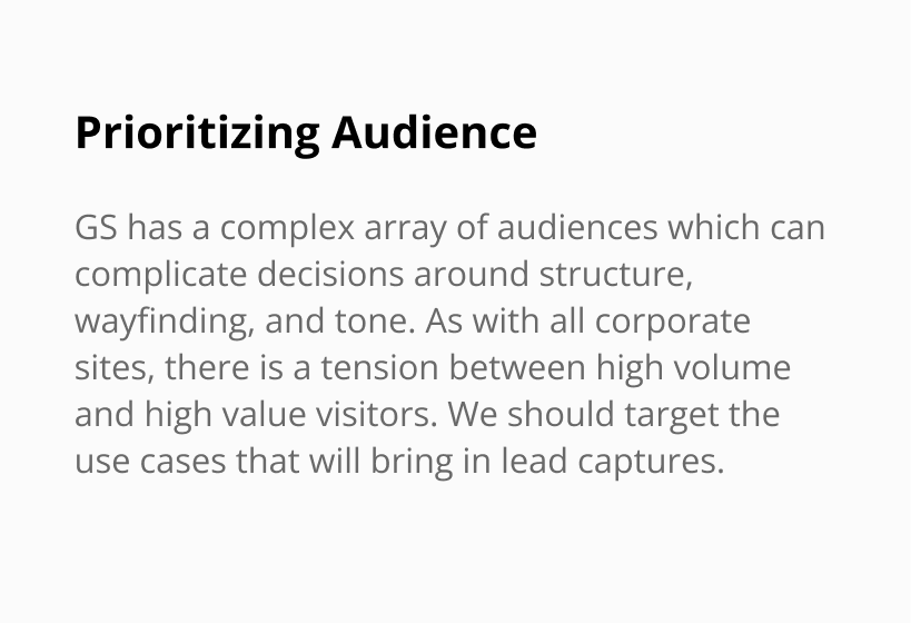
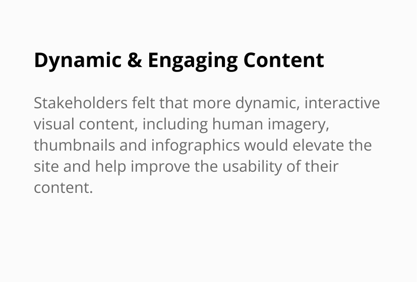
Key themes from GS stakeholders
We began by interviewing 50+ PWM executives and advisors in 7 regions on the key goals they were looking for in their rebrand, grouping them into four key themes focused on humanizing the brand and delivering a clear narrative.
INTERVIEW ANALYSIS
Key themes from high-net-worth users
We interviewed 14 HNWI users, with 9>$10M, 5 <$10M imminent qualifers. We found that users are looking for emotional validation, personal connection, and relatability over tangible research.
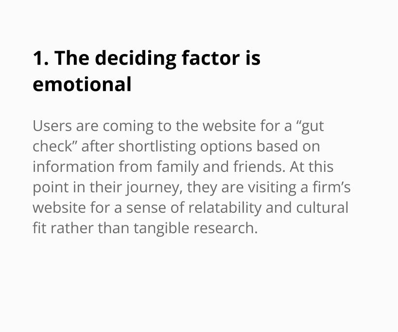
KEY INSIGHT 1
HNWIs shared that the deciding factor was always emotional: a feeling of reassurance, cultural fit, and being able to relate to the firm.
USER GOALS
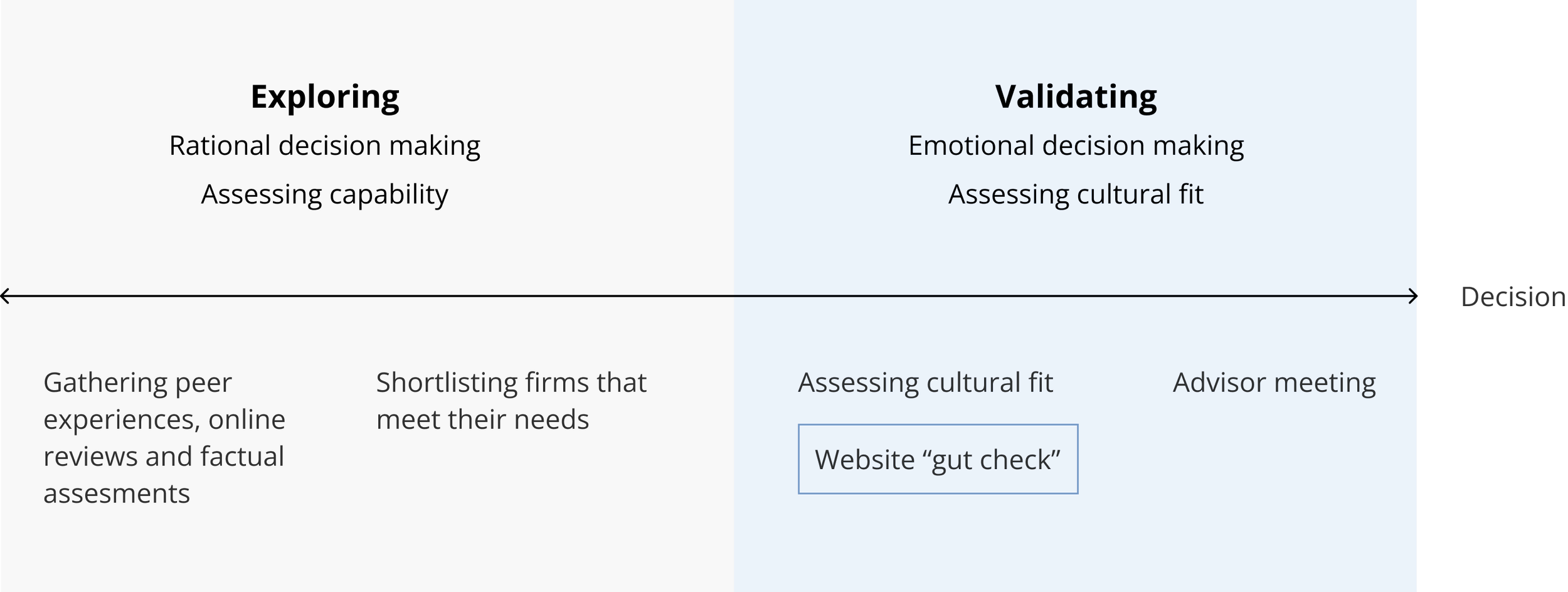
Mapping the user journey
From our interviews, we quickly mapped out the user journey to understand at what point HNW and UHNW individuals were going to the website to understand what exactly they would be looking for when visiting. We split the journey into two areas:(1) exploring the options they have and (2) validatinga shortlisted set of options before making their final decision.
Phase 1: Exploring
We found that the rational, research-based decision making comes primarily from trusted sources who know them personally (family, friends, and colleagues), because those individuals understand their personality and situation.
Phase 2: Validating
After getting recommendations and shortlisting firms, they move onto the validating phase by visiting advisor's websites, not for detailed research, but to gauge emotional resonance and cultural fit. Currently, the PWM website falls short in this area because it feels impersonal and lacks the warmth and human touch that clients look for in a trusted advisor. Without features like advisor bios or personal stories, it's hard for potential clients to form a connection.
KEY INSIGHT 2
HNWIs are coming to the website for a final validation after already shortlisting firms from peer recommendations and objective assessments.
CONSOLIDATING INSIGHTS
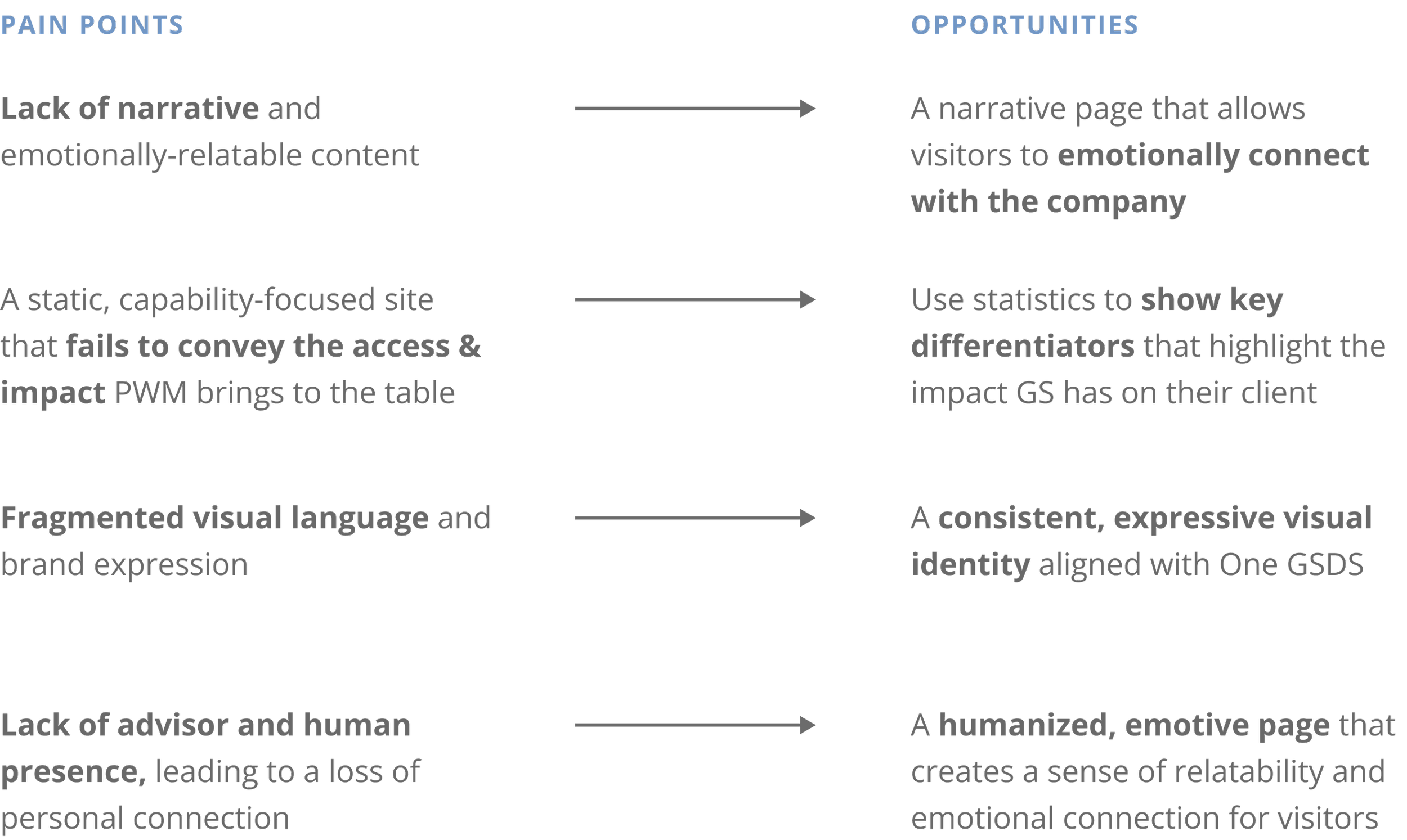
Identifying opportunities
Both GS stakeholders and HNWI users emphasized the importance of human and emotional connection. Based on interviews with both of these groups, we consolidated the key pain points we were hearing from both sides, and identified corresponding opportunity areas to address them.
—
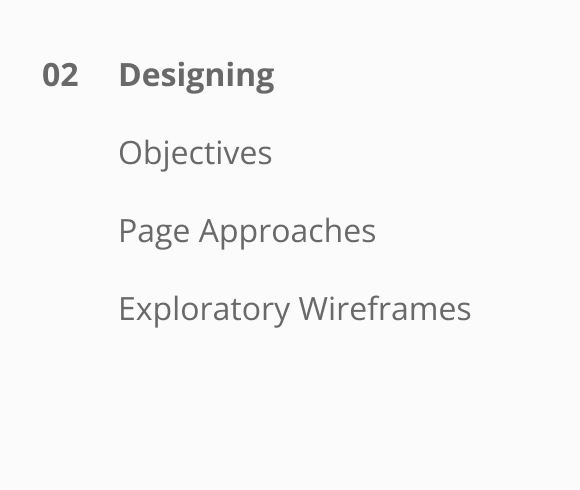
PHASE 02
Designing an advisor page
We proposed designing a net new advisor landing page in order to address the key pain points of a lack of human relatability and narrative content. By highlighting the people and story of the firm, we would create the emotional connection necessary to drive client aquisition at this point in their decision-making process.
I led the end-to-end design process for this page from scratch, from devising a strategic approach, to the development of exploratory wireframes, to the high-fidelity prototypes that were met with enthusiasm from the clients.
DESIGNING
Aligning on objectives
We began by first aligning on the key objectives for the net new advisor landing page to keep our goals in focus and ensure they were in sync with our client’s needs.

Humanize the firm by building relatability and personal connection with its advisors

Disprove brand misconceptions by showcasing the culture and diversity of the firm

Show specific differentiators to highlight the unique value proposition GS brings

Build credibility of advisors through highlighting their expertise and accomplishments

Provide emotional reassurance that GS advisors can understand and empathize with potential client needs that GS advisors can understand and empathize with potential client needs

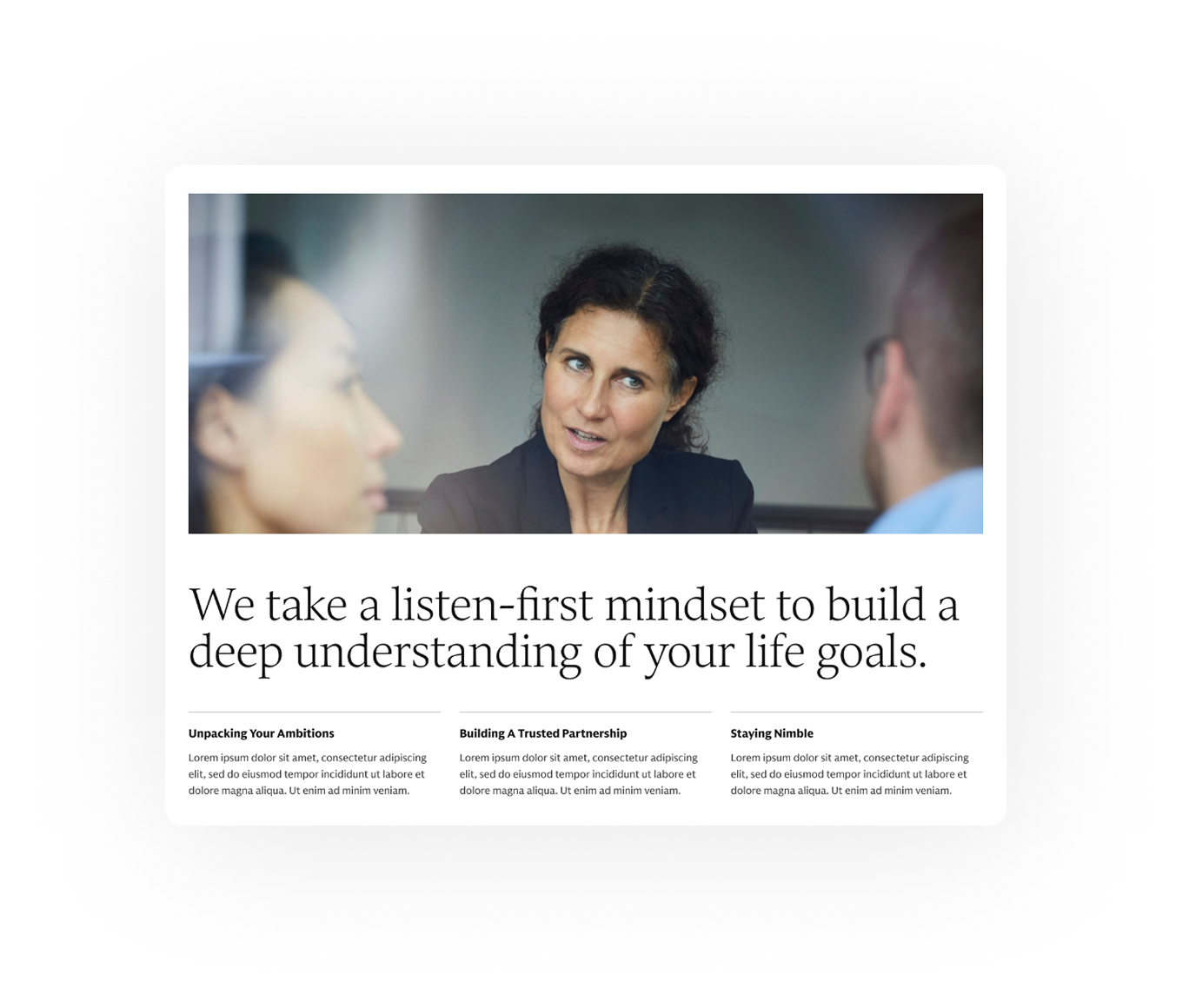
Use narrative storytelling to increase emotional engagement and build trust
DESIGNING
Approach to concept exploration
After aligning on objectives, we wanted to explore a range of approaches to (1) align on what would help achieve our user’s needs and (2) deepen understanding of our stakeholders’ vision. We used low-fidelity exploration of these approaches to ensure alignment, gather early feedback, and quickly iterate on options before diving into more detailed designs.
DESIGNING
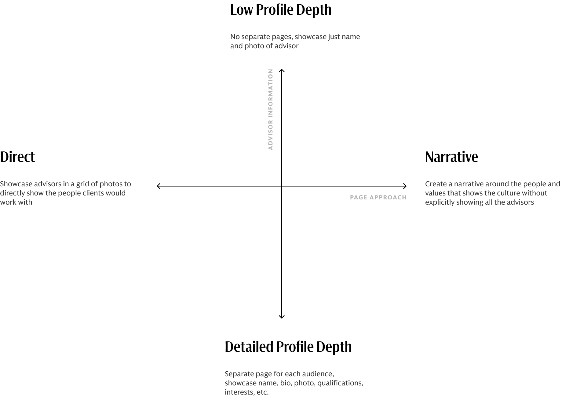
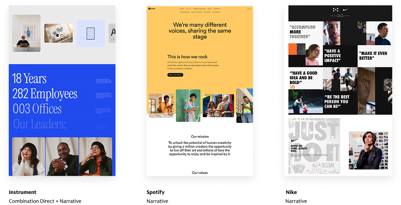
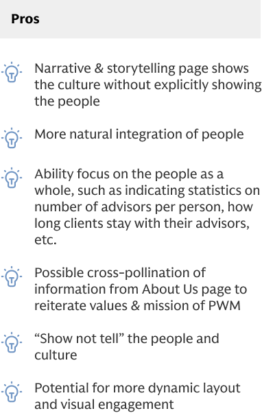
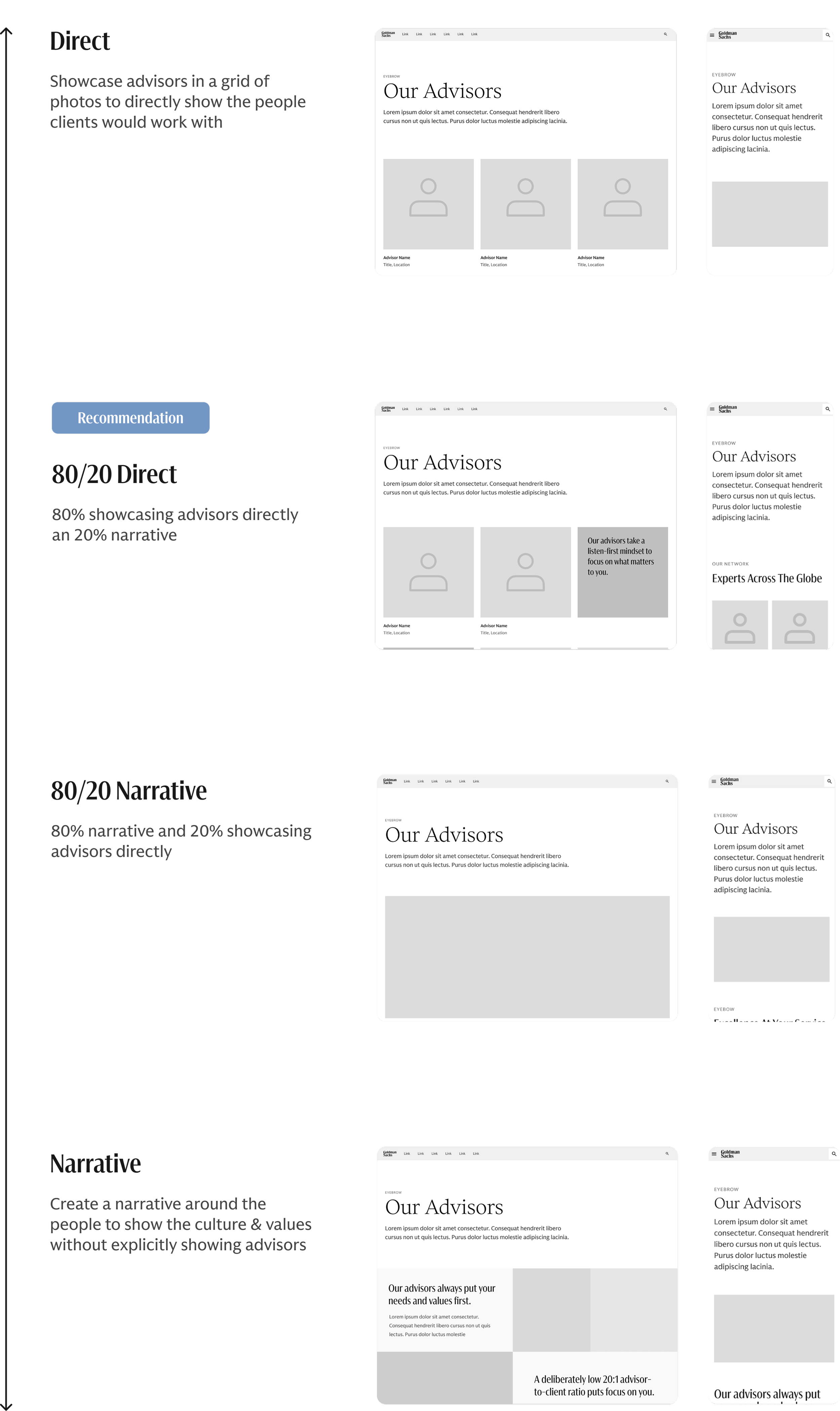
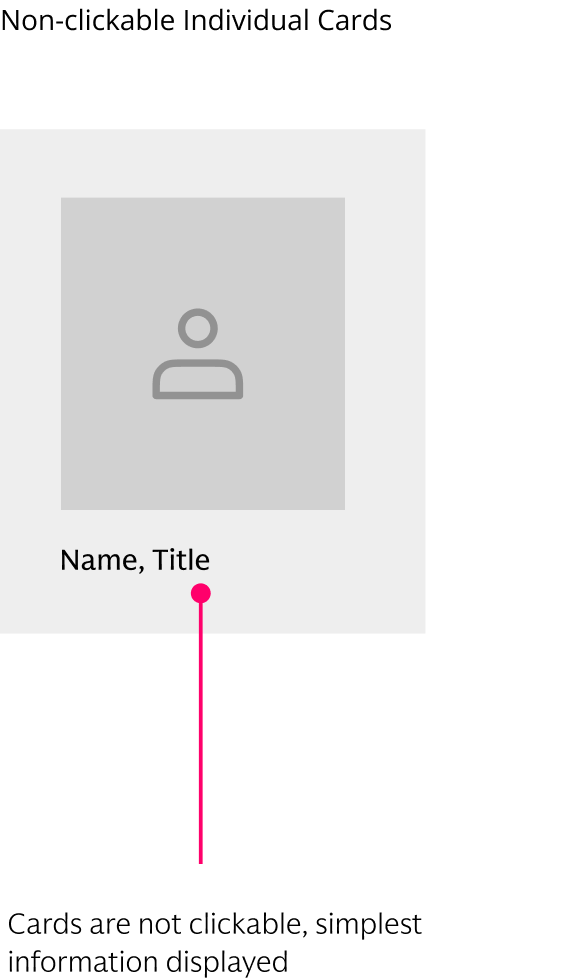
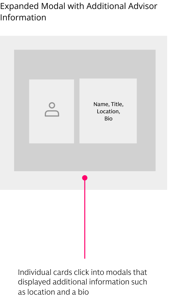
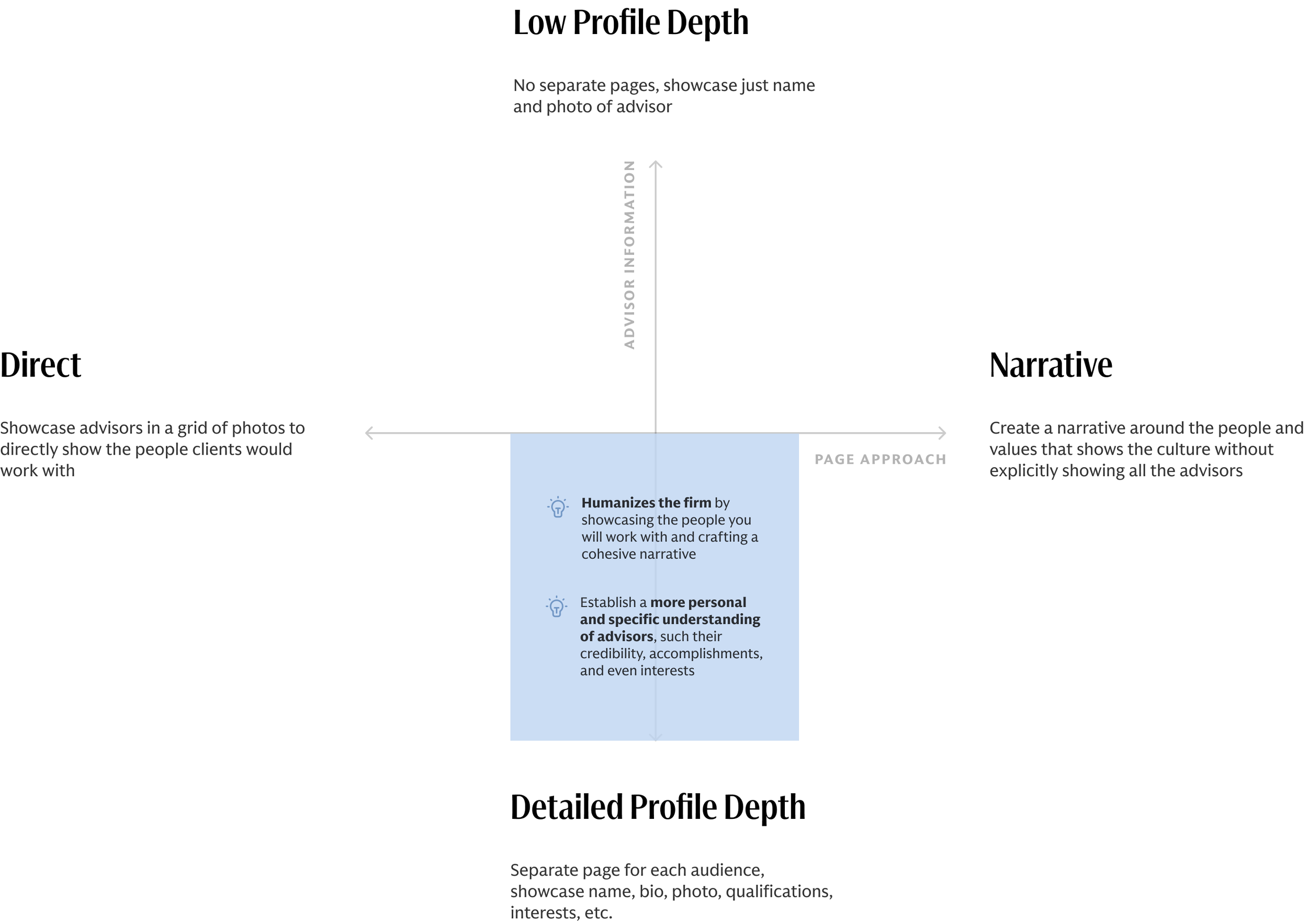
1. Page approach
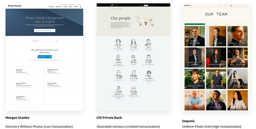
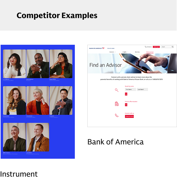
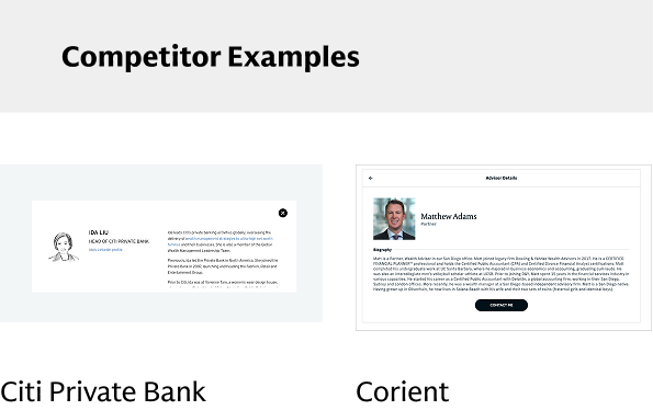
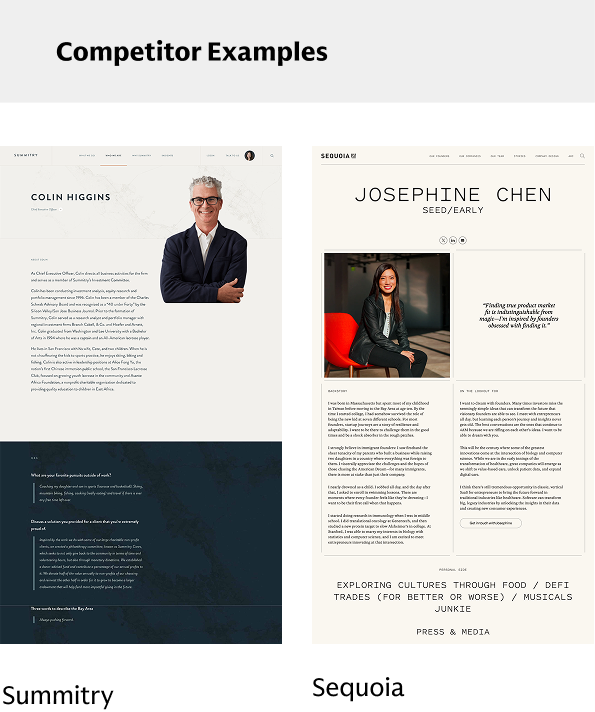
We created a scale from (1) directly showing advisors to (2) focusing on a narrative-based approach that showed the culture and values without individual advisors, and presented it to the client to align on what would be most effective and feasible. We began by showing the clients industry examples on both sides of the scale, highlighting the strengths and weaknesses of each approach to help determine what would be the best fit for Goldman Sachs.


EXPLORATORY DESIGNS
We recommended an approach in the middle, and aligned on the 80% Direct, 20% Narrative direction.
From these competitive examples, we also quickly mocked up some low-fidelity screens to visually express what the advisor page could look like at different points on this scale.
We recommended an approach in the middle, and aligned on the 80% Direct, 20% Narrative direction to showcase a directory of advisors and highlight the people, while also telling a story about the brand as a whole. This balance of narrative would allow us to highlight a story around GS differentiators and values, while also allowing users to directly see and browse the advisors they would be working with and develop a more personal connection with the actual humans at the firm, ultimately creating a more emotive, humanized experience.
DESIGNING
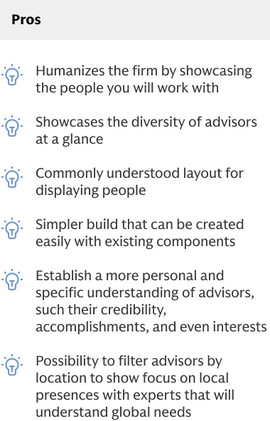
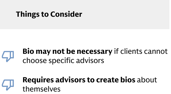
2. Advisor presence
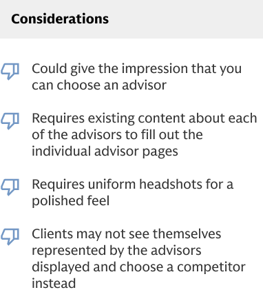
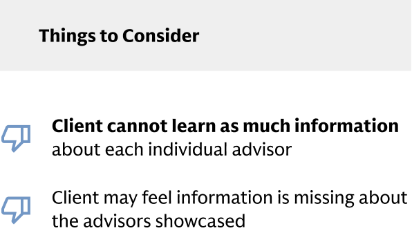
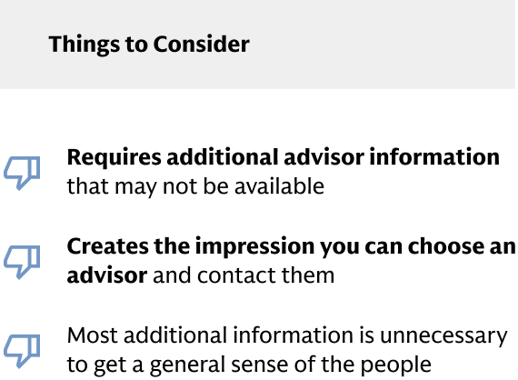
Aside from page approach, the second scale we wanted to align on was the amount of advisor presence on the website. We were aware that GS was wary about putting too much information about each individual advisor on the website since (1) it could give the impression that you could choose and advisor and (2) it could lead to excessive outreach towards advisors if too much contact information is disclosed.


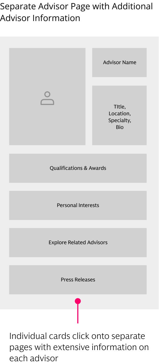


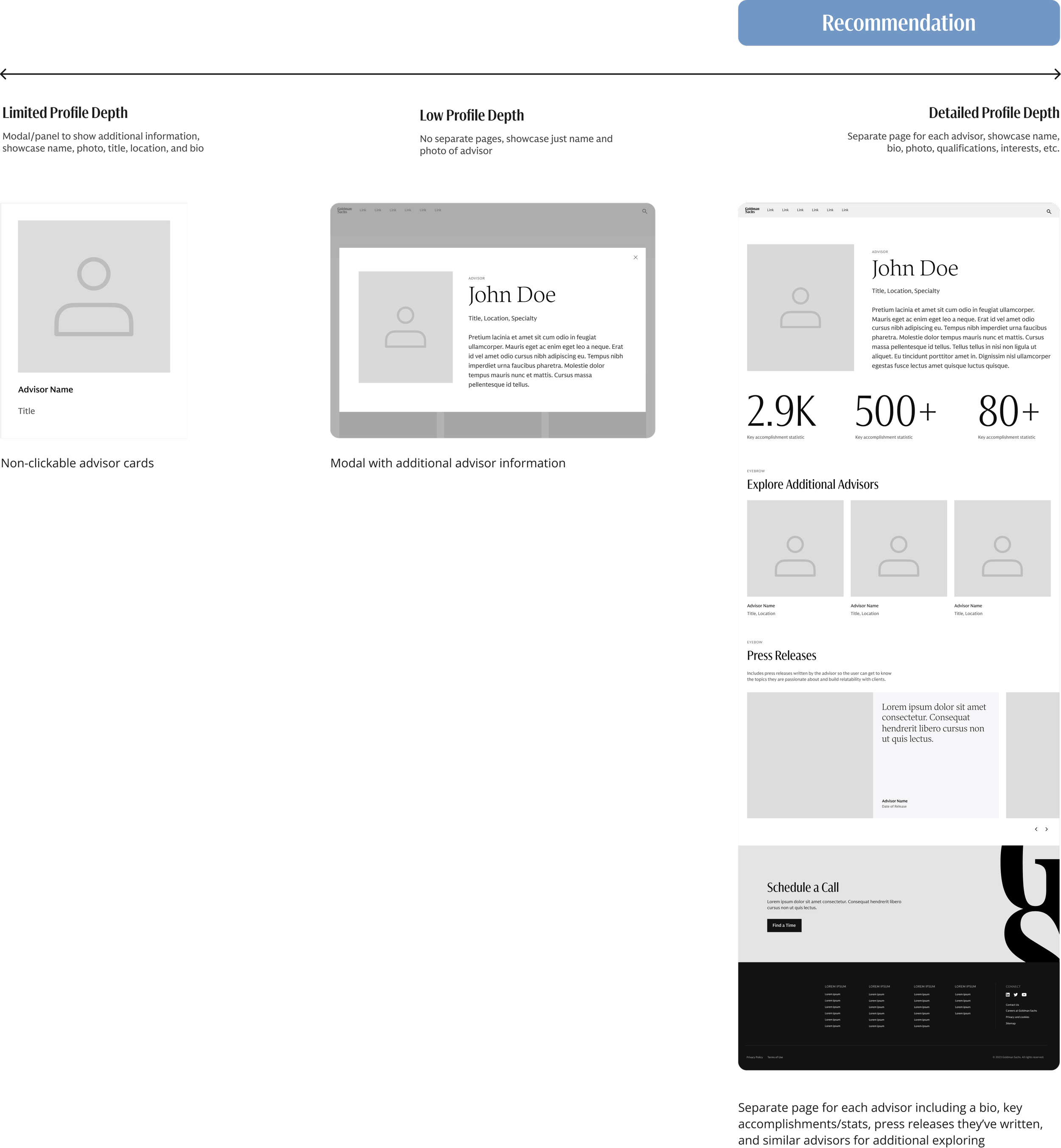
THE CHOSEN APPROACH
Our clients aligned on using a combined direct-narrative approach with a detailed profile depth for each advisor.
We would need to consider striking a balance between showcasing the actual advisors clients would work and crafting a cohesive narrative around the culture of the firm as whole.
DESIGNING
Iterating
After aligning on chosen direction with the Goldman clients, we did another iteration of our preliminary wireframes, keeping in mind the opportunities we discovered for more emotional connection and differentiation from competitors.
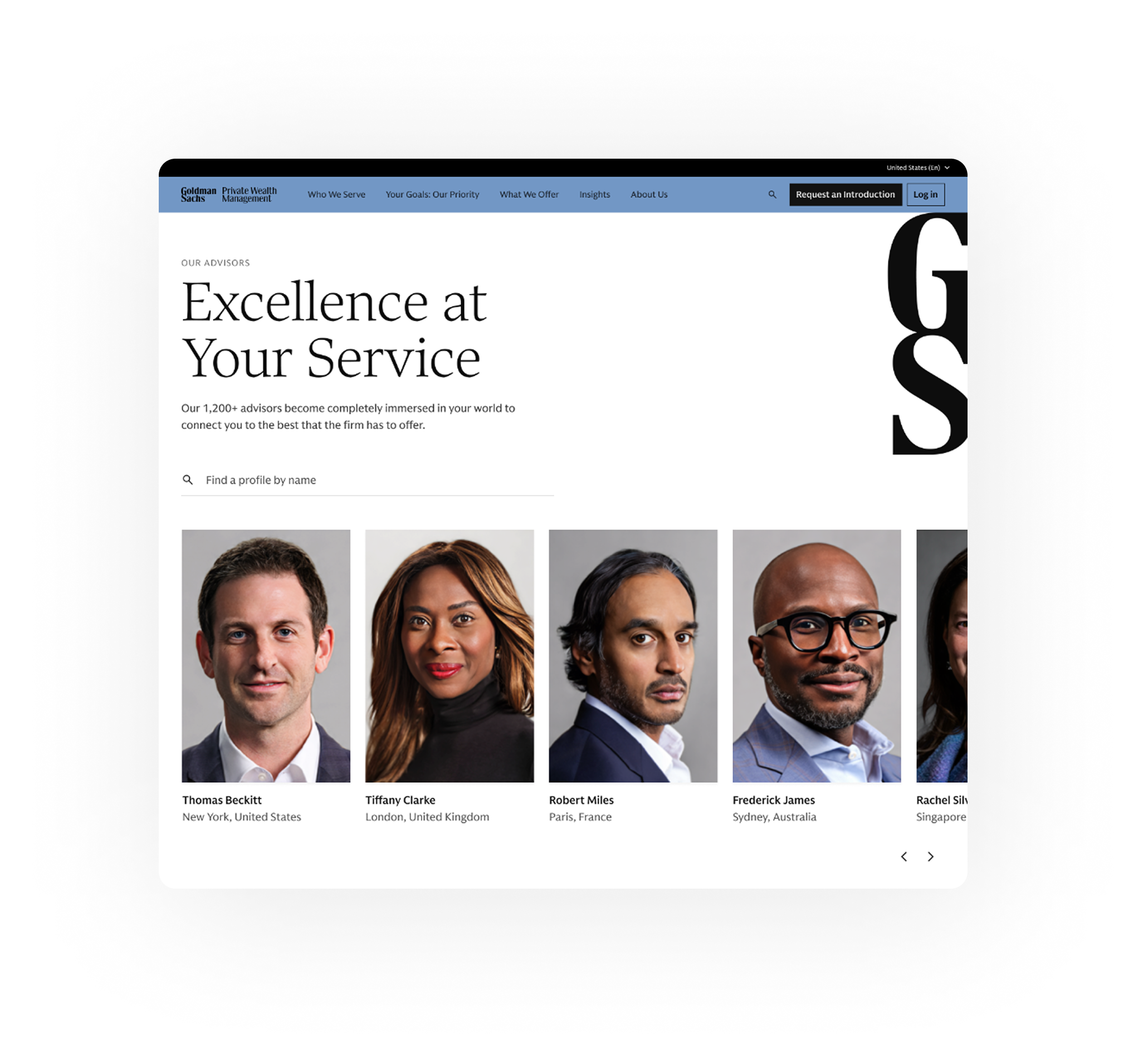
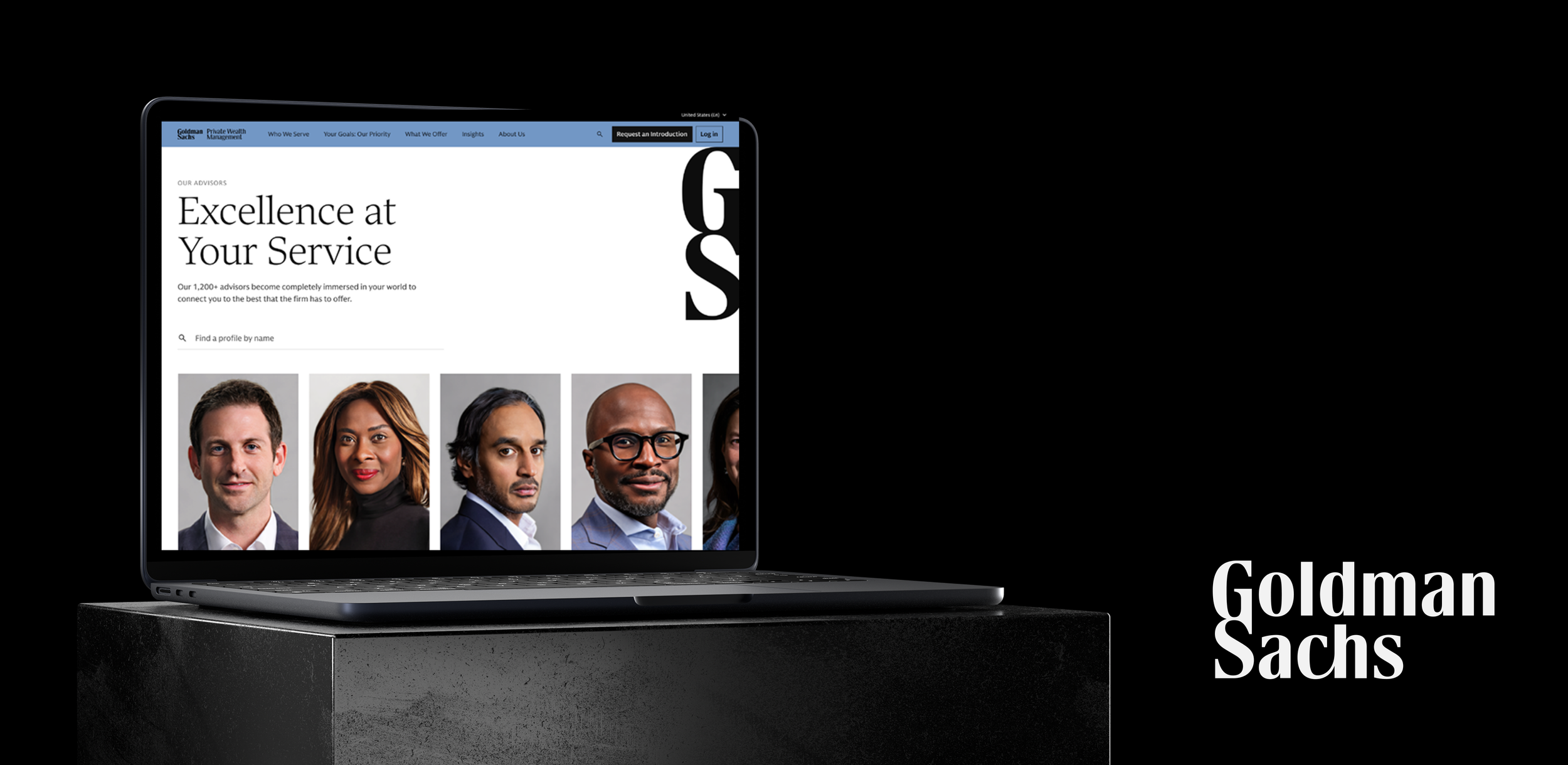
1. Advisor Landing Page
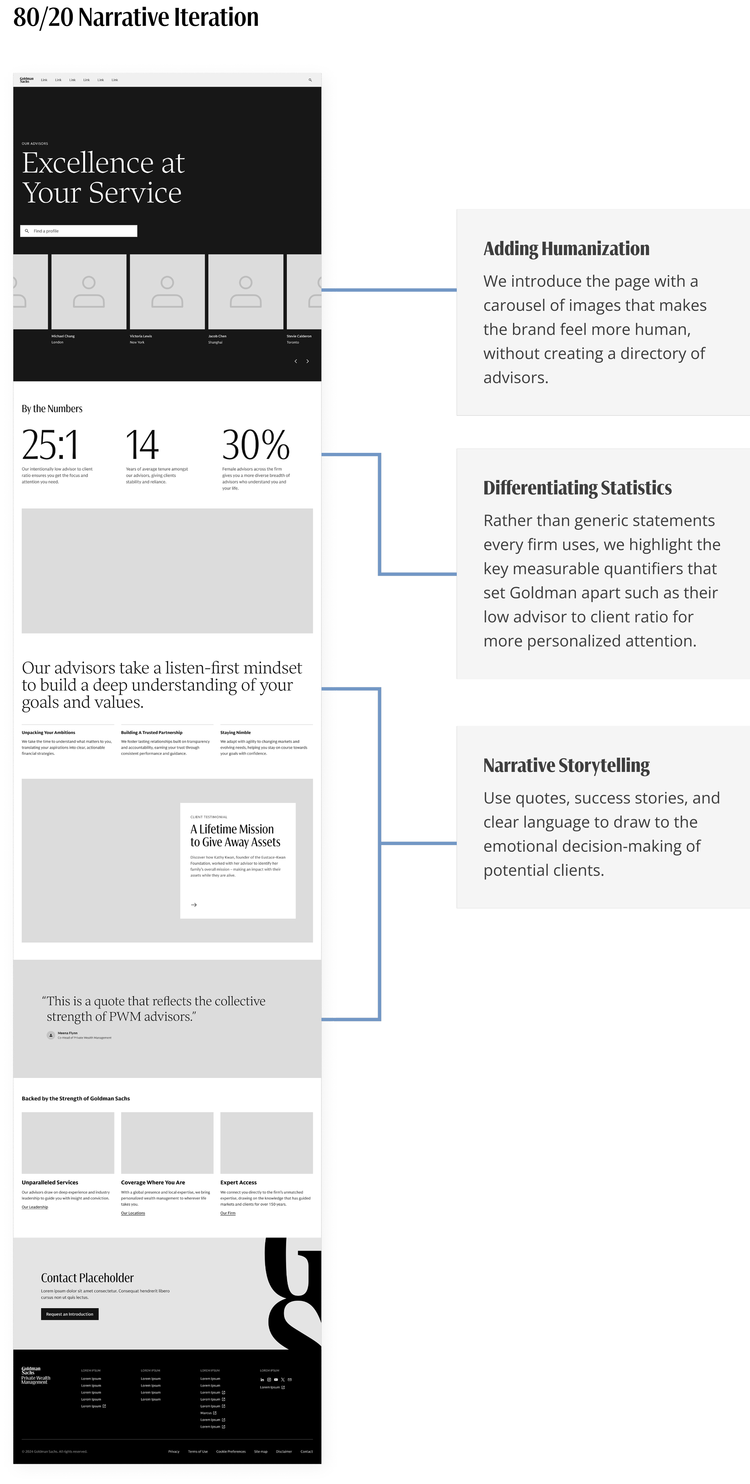
We refined the chosen 80/20 Narrative to Direct Approach wireframe after gathering more information on the actual content and key differentiators our stakeholders wanted to show. These included their value statements, differentiating statistics, and placeholder stories & testimonials.
One of the key design changes we made from the first iteration was proposing an automatically-rotating carousel of advisors instead of a grid to create a more space-efficient way to showcase the advisors and add visual engagement at the top of the page. While this would be a net new component they would have to build, we believed it would be worth the additional effort.
2. Advisor Profile Page
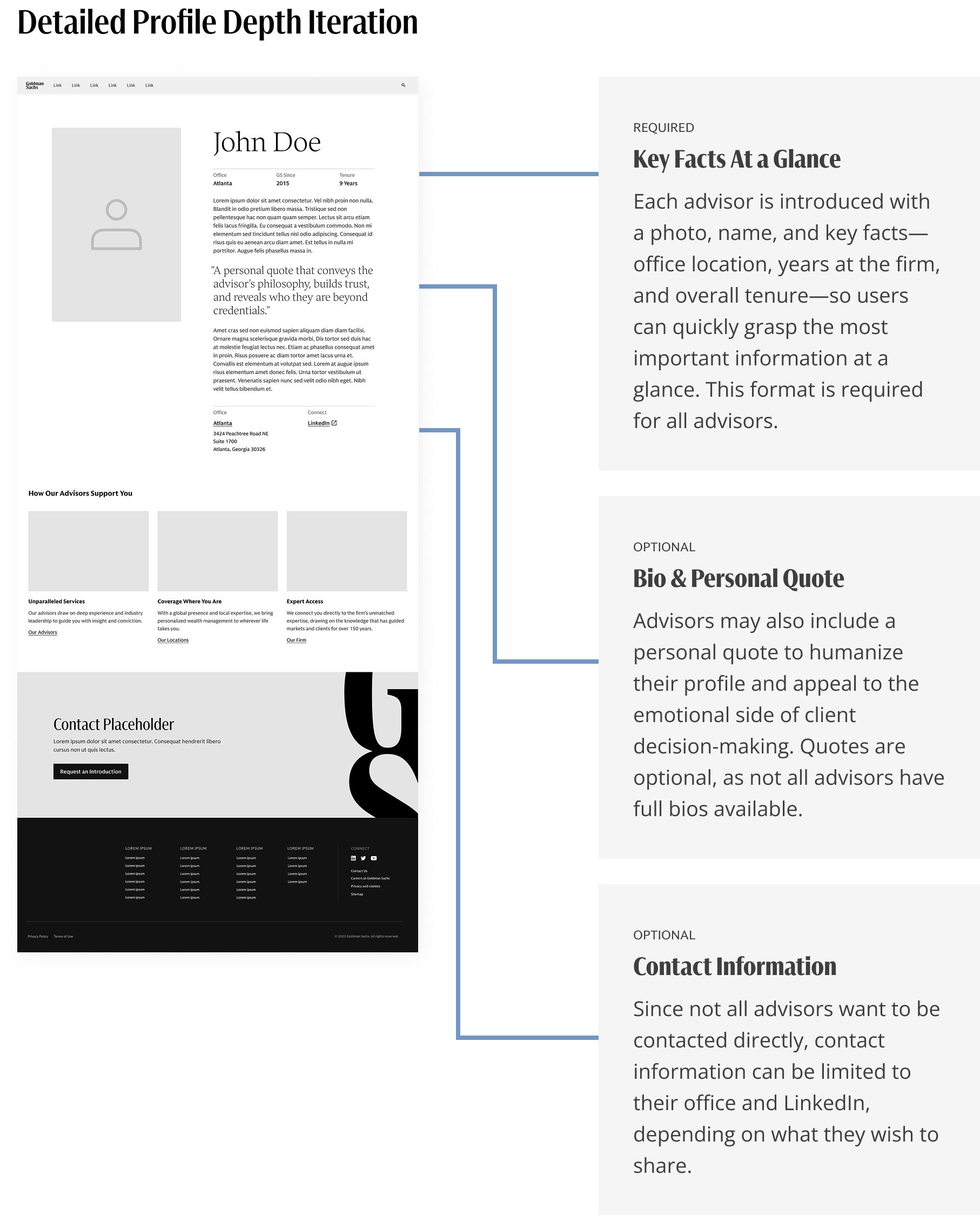
After aligning on the detailed profile depth for each individual advisor page, we worked with the content team and stakeholders to determine they key facts would be necessary and available to show for each advisor: office location, years at the firm, and overall tenure, highlighted prominently at the top of the page. Additional elements such as a bio, personal quote, or contact information can further humanize the advisor and provide richer context. However, since this information is not consistently available across all advisors, these elements are considered optional for the MVP.
DESIGNING
High fidelity designs
After aligning with Goldman clients on the mid-fidelity page structure, we collaborated with the content team and client stakeholders to incorporate real advisor profiles and content into the design. At the same time, we began developing additional states of each page to capture more complete user scenarios. The designs were well-received by the client and subsequently handed off to development for implementation.
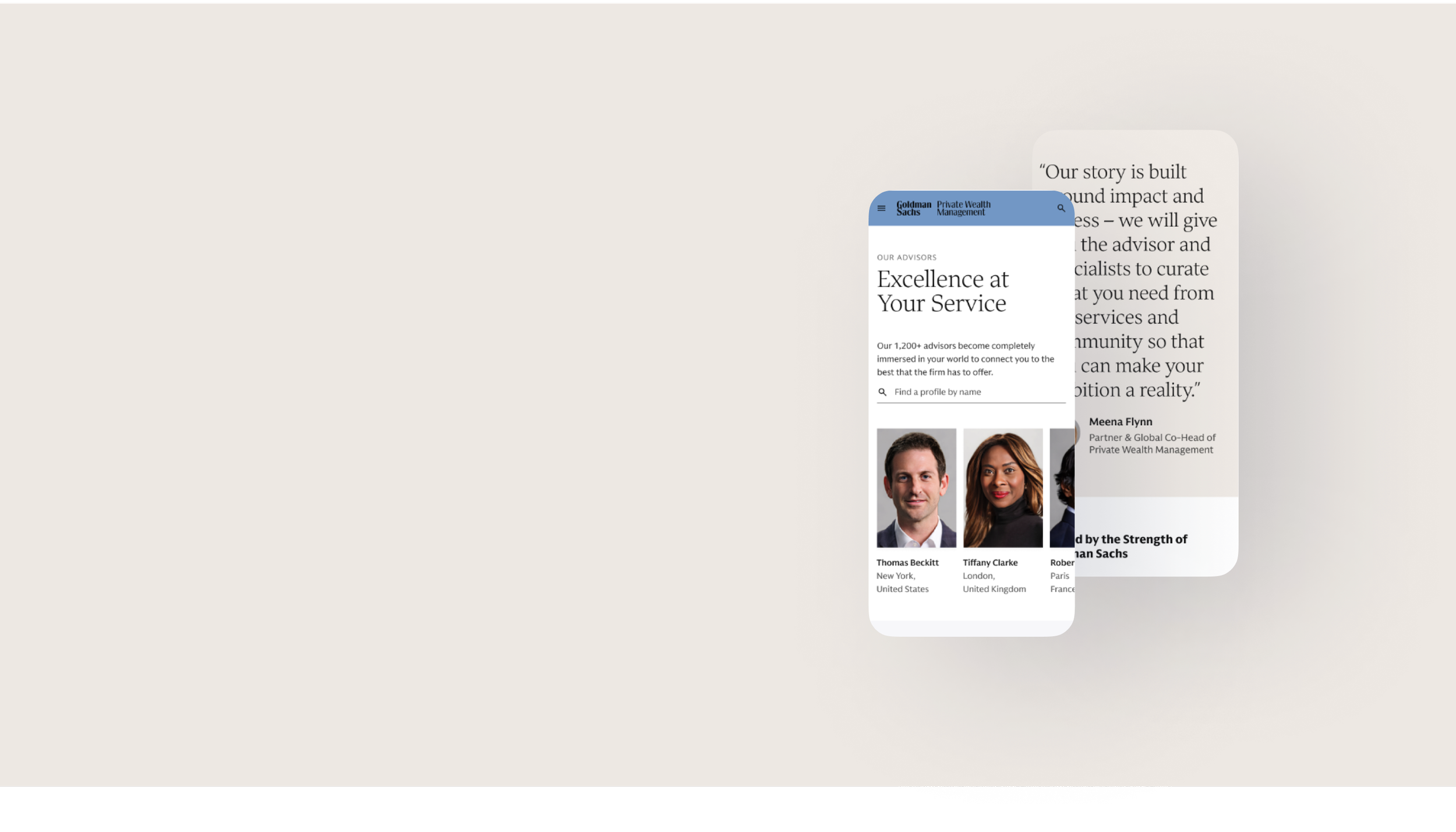
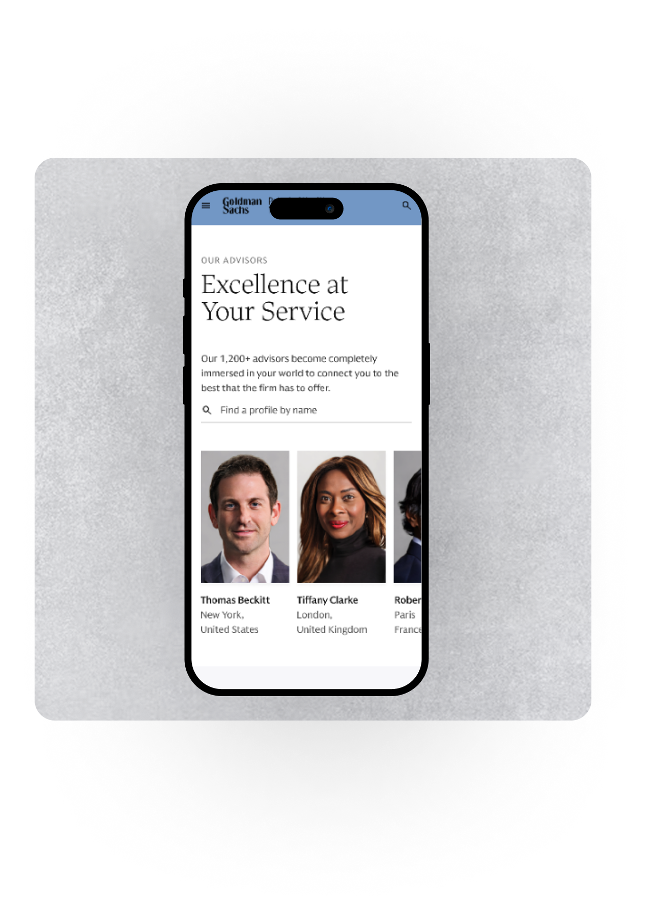
Advisor Landing Page
From the mid-fidelity design, we added in real advisor profiles, refined the language, and added multiple client success stories to deliver a more refined experience.
Advisor Profile Page
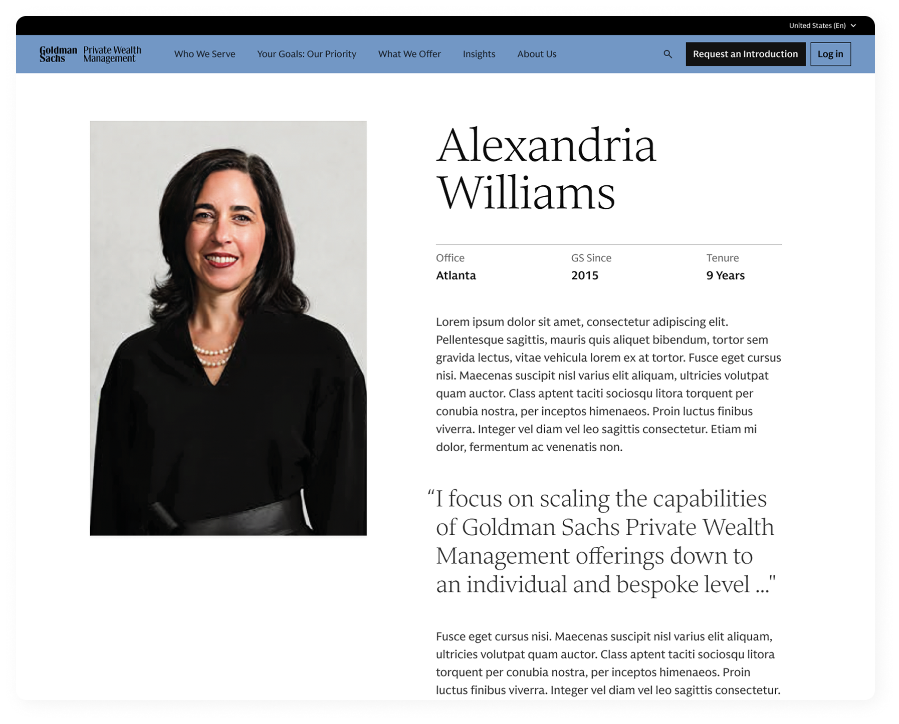
From the mid-fidelity wireframe, we added an example profile from Alexandria Williams to test how real content integrates with the design and to validate the structure.
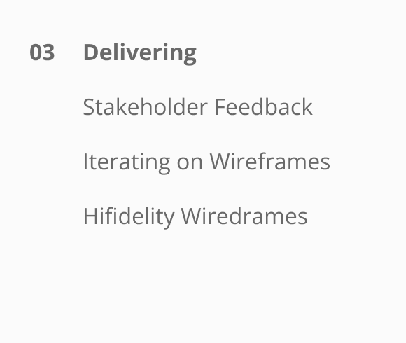
DELIVERING
Final design
Our net new Advisor Landing Page for PWM highlights the people of the firm and uses narrative-based storytelling to cater towards the emotional decision-making process of potential clients to ultimately drive customer aquisition for Goldman Sachs.
SOLUTION
An advisor landing page that creates a more humanized and engaging experience, appealing to the emotional-deciding factor of HNW individuals and ultimately drive lead captures.
Our vision was to help Goldman Sachs redefine the digital experience of Private Wealth Management by humanizing the firm and appeal to the emotional decision-making process of HNW clients. We aimed to transform the website into a personalized, emotive experience that would not only address the core functional and informational needs of the site, but also create an engaging and warm environment that would foster trust and relatability.
FINAL DESIGN
Key features
FEATURE 1
Humanizing the firm with advisors
Use advisor images and profiles to create a more emotive and engaging experience that allows potential clients to foster trust and reliability.
FEATURE 2
Highlighting differentiators from competitors
Using specific, differentiating statistics to distinctly show why Goldman Sachs is different from other firms, rather than providing the same generic language competitors use.
FEATURE 3
Narrative-driven storytelling
Show success stories and quotes from real clients to engage potential clients, allowing them to connect with the story and values of Goldman since they’ve already done the quantitative research.
CONCLUSION
Benefits of the new advisor landing page
The redesigned Advisor Landing Page elevates Goldman Sachs PWM’s digital presence by creating a more human, engaging, and emotionally resonant experience for prospective clients.
LOOKING FORWARD
Future steps
Evaluating and testing the system
Due to time constraints, our team designed an MVP based on initial stakeholder and user interviews. With more time, I would further evaluate how users respond to the redesigned page in areas such as emotional engagement, conversion, and differentiation.
Key questions include:
Do users feel more connected to the firm through advisor profiles, testimonials, and cultural storytelling?
Do advisor profiles increase trust and confidence in reaching out?
Does the page improve conversions and clearly communicate next steps?
Is the value proposition compelling and differentiated from competitors?
Does the site effectively communicate Goldman Sachs’ reputation, personalization, and client focus?
Given more time, I would use a combination of quantitative metrics (such as conversions, advisor profile clicks, and consultations booked) and qualitative feedback (including trust, emotional engagement, and perceived personalization) to better understand user behavior and continue refining the design.
REFLECTIONS
What I learned
The power of emotional design in financial services
This project reinforced how important emotional connection is within financial services, an industry often perceived as transactional. Through personalized storytelling, advisor profiles, and culturally relevant content, I learned how thoughtful design can create a more human, trustworthy, and engaging experience.
Balancing stakeholder vision and user needs
Working closely with stakeholders at Goldman Sachs, I learned how to navigate the balance between client expectations and user needs. The stakeholders wanted the site to be luxurious and flawless—something akin to walking into a high-end store like Dior or Chanel—while users wanted to feel a more human, approachable side of the brand. I had to merge both these goals: creating a visually elevated experience while also ensuring the content was approachable and personal.
Brand storytelling is key for digital experiences
One of the most powerful lessons I took from this project is the importance of storytelling in shaping a brand’s digital presence. Goldman Sachs, like many firms, needed to move beyond product descriptions and create a narrative that spoke to their audience's values, aspirations, and emotions. This helped me see how brand storytelling can serve as a bridge between a company’s mission and the user’s personal journey.
Overall, I’ve deepened my understanding of how to design emotionally engaging experiences, balance stakeholder expectations with user needs, and work collaboratively in cross-functional teams. This experience strengthened my ability to create thoughtful, user-centered solutions that align both business goals and human connection.