Ghostery
U X D E S I G N I N T E R N S H I P
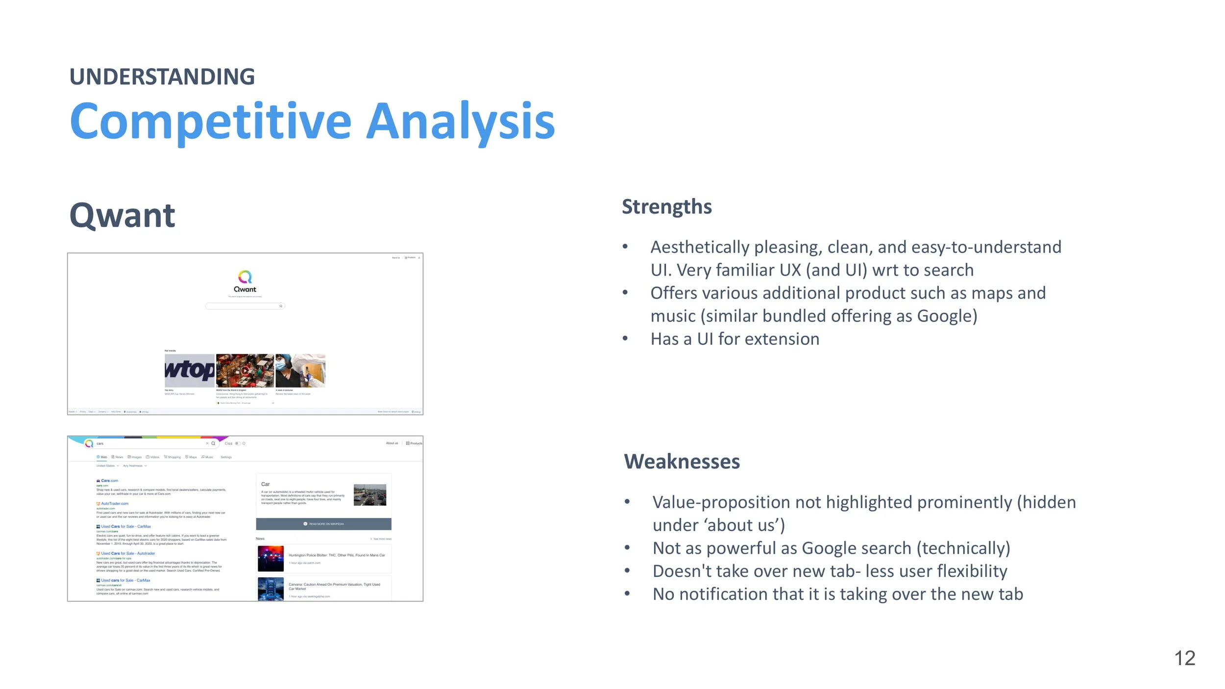
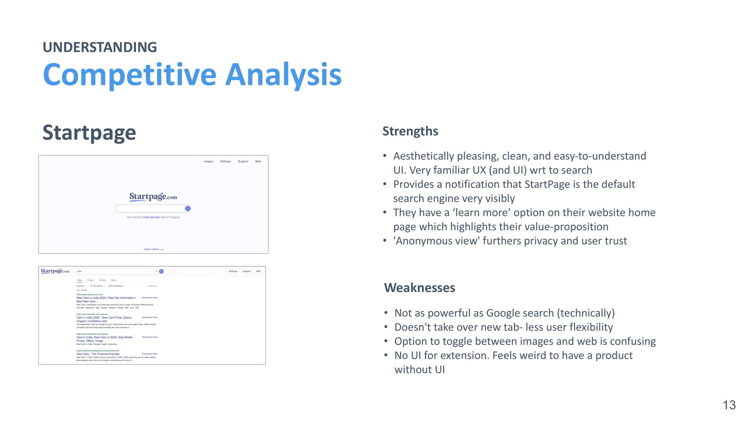
Ghostery
Redesigning online privacy and security for over 7 million users
O V E R V I E W
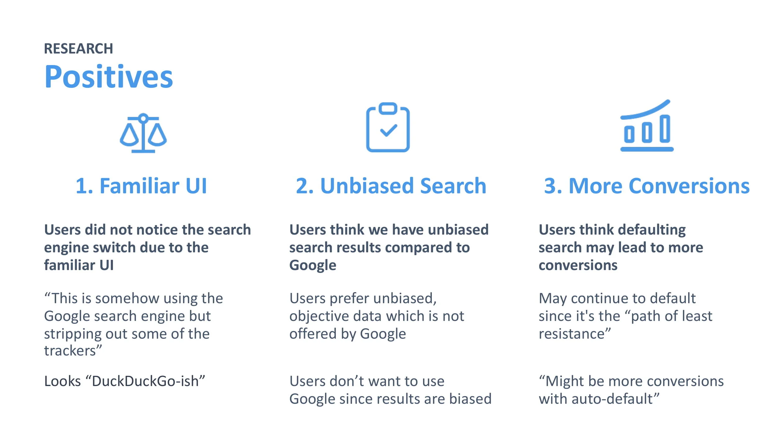
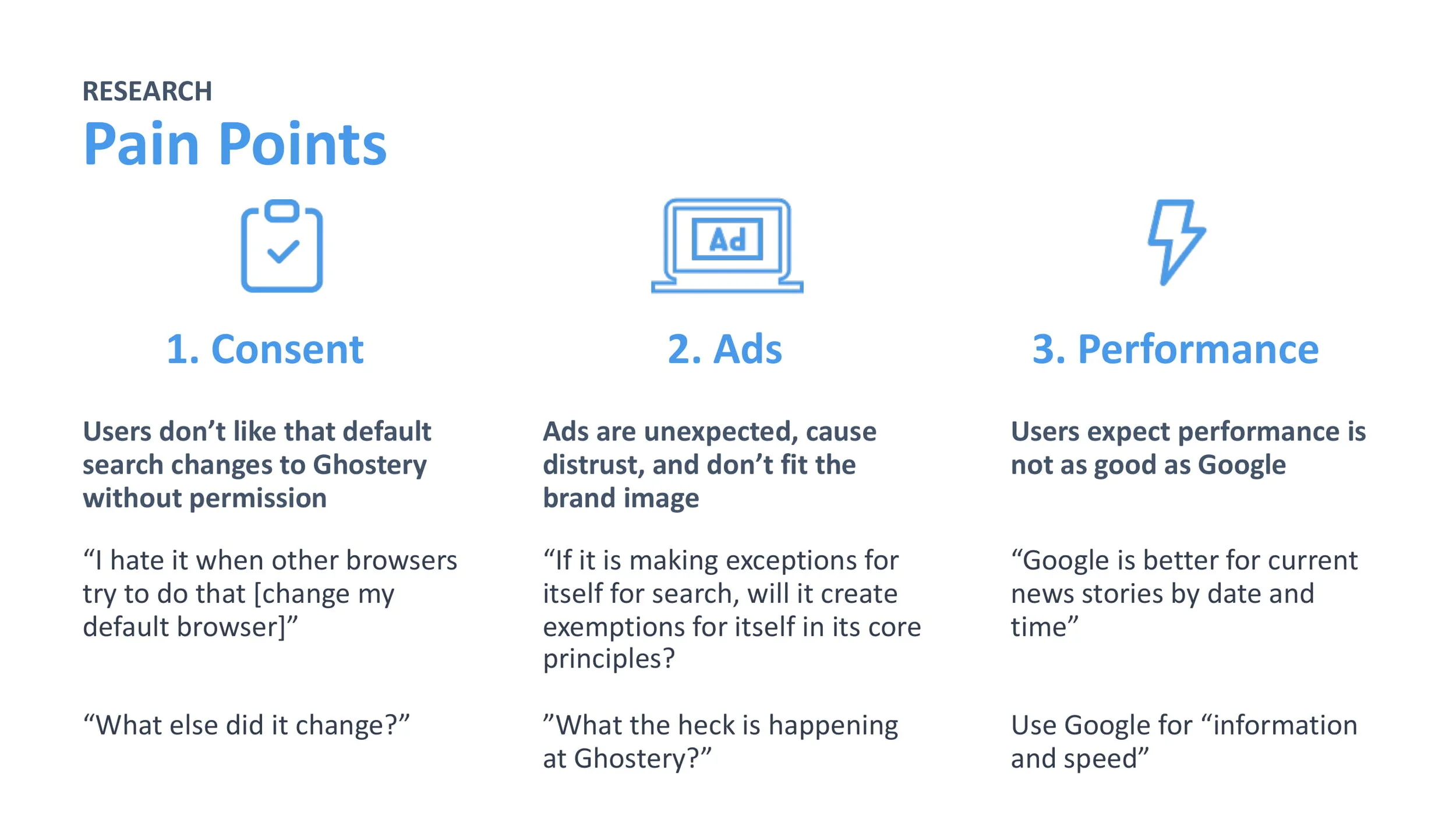
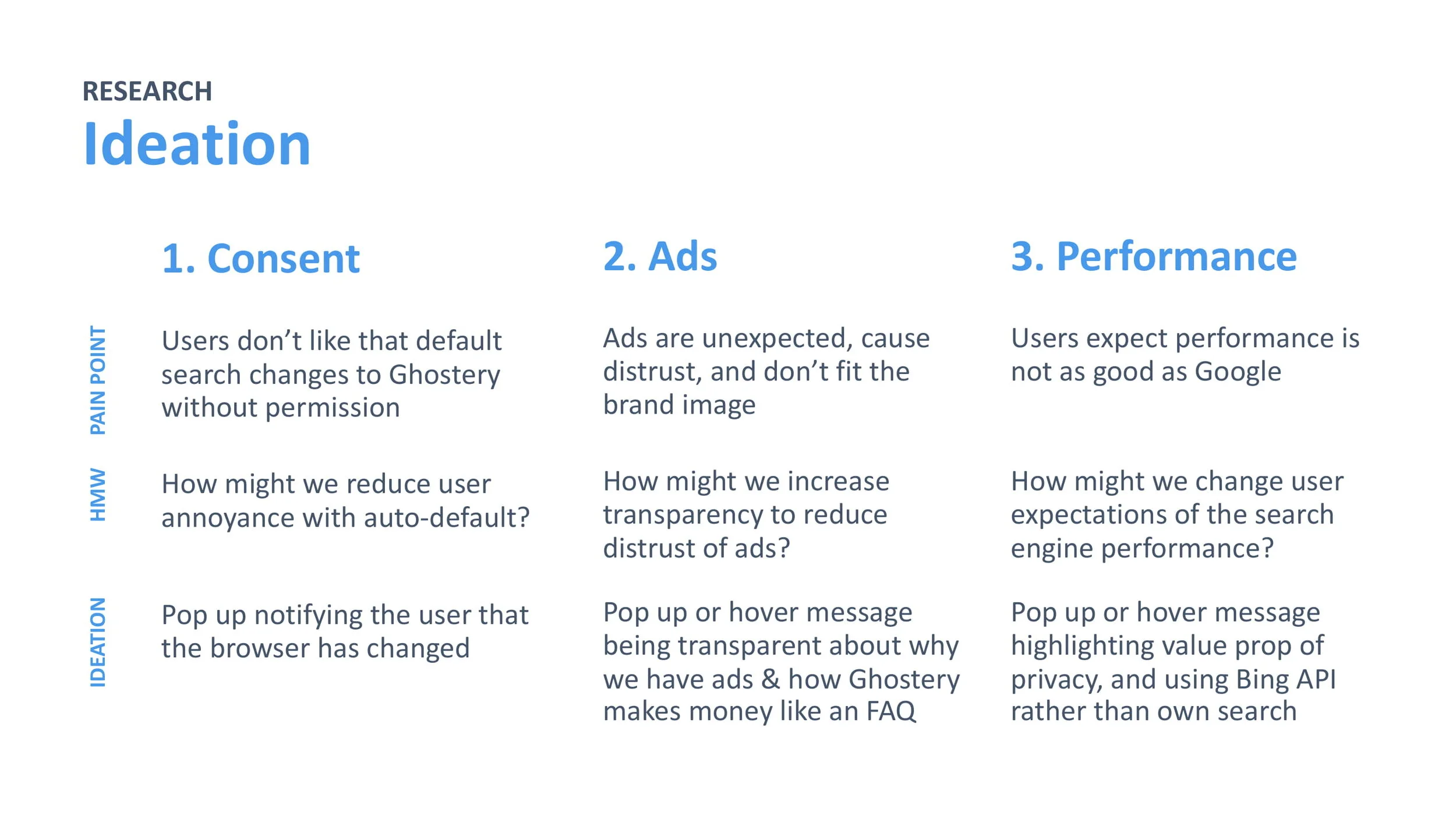
About the Project
During the summer of 2020, I was a selected to join Ghostery as a UX Design Intern, where I completed three design sprints on the Midnight Onboarding, Umbra Checkout, and Browser Extension Search teams, working closely with a team of designers, researchers, project managers, and engineers.
DURATION
8 Weeks
TEAM
Sharon Jia, Shyen Vakharia, Melissa Bashur, John Evans
TOOLS
Sketch, InVision, Framer, Miro, Jira, Confluence
SKILLS
Remote User Research, UI Design, Project Management
_
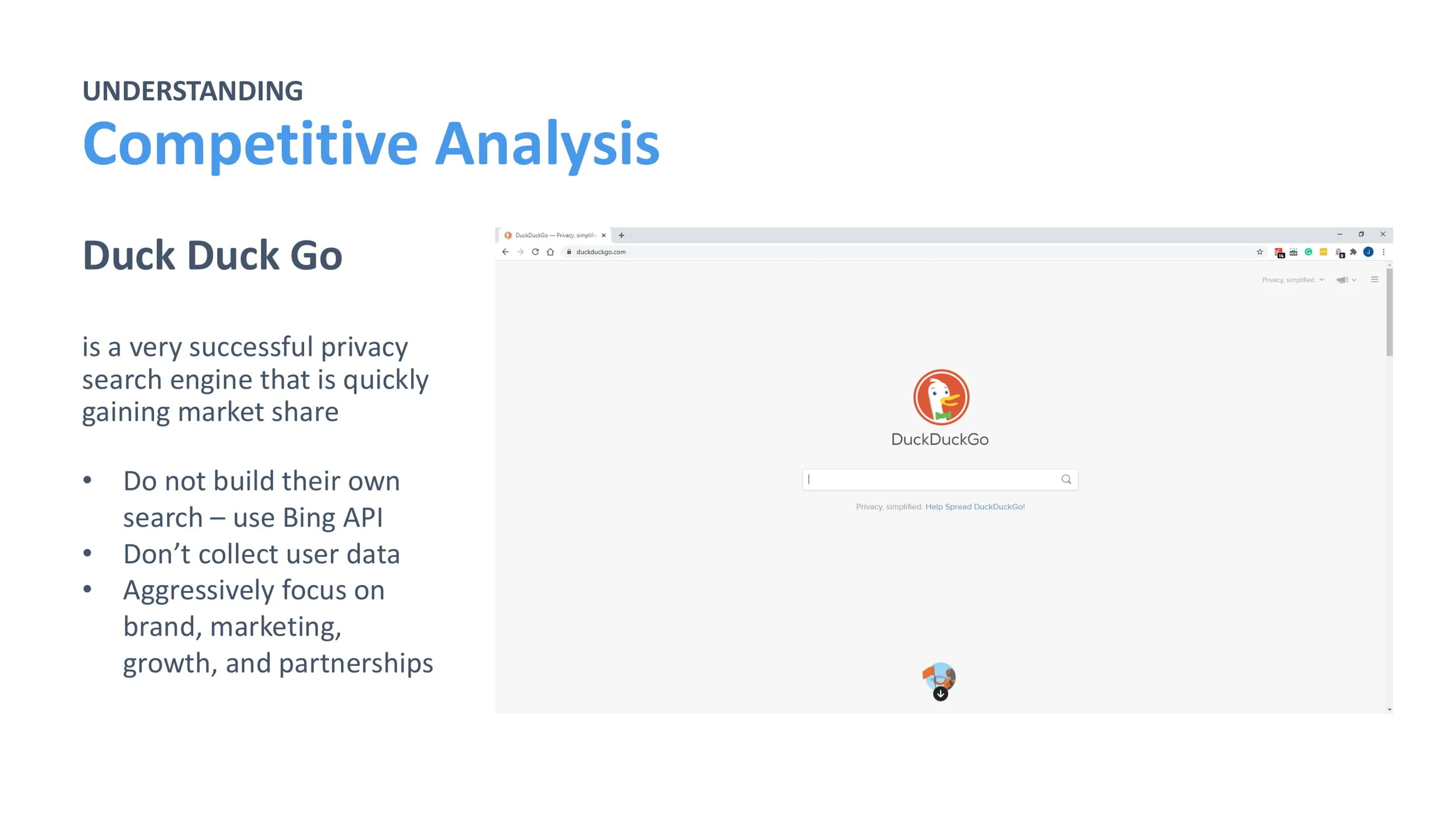
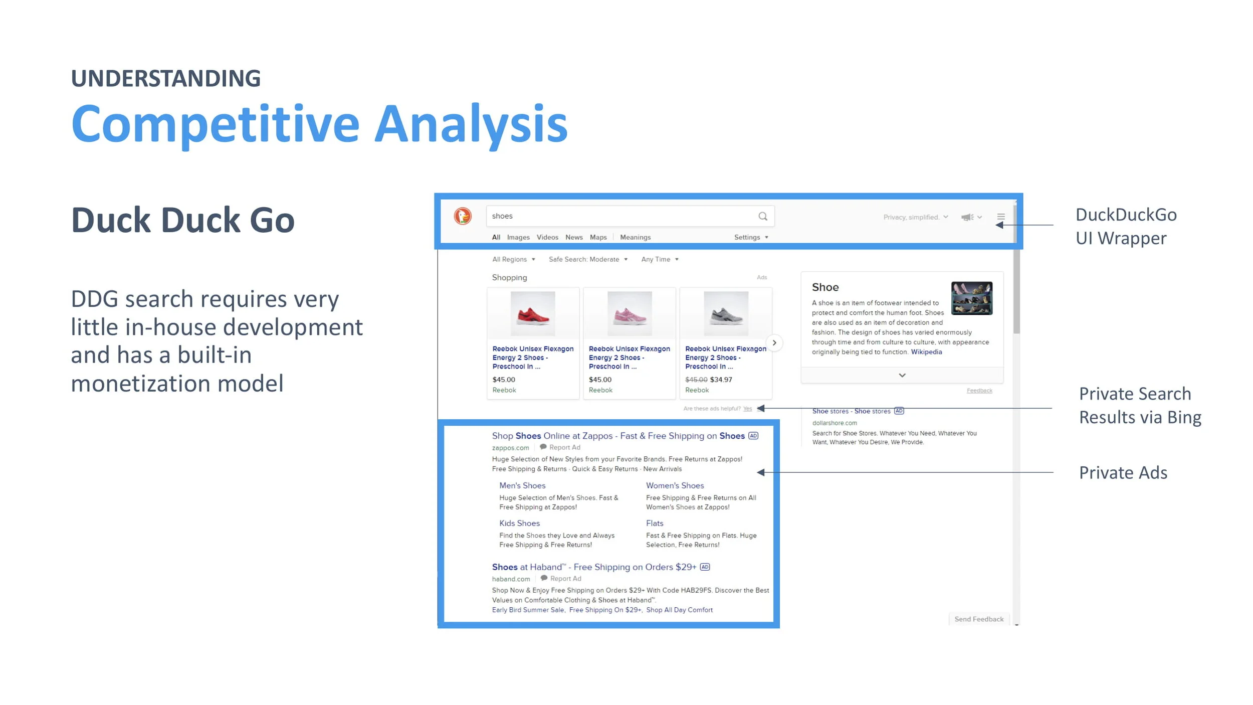
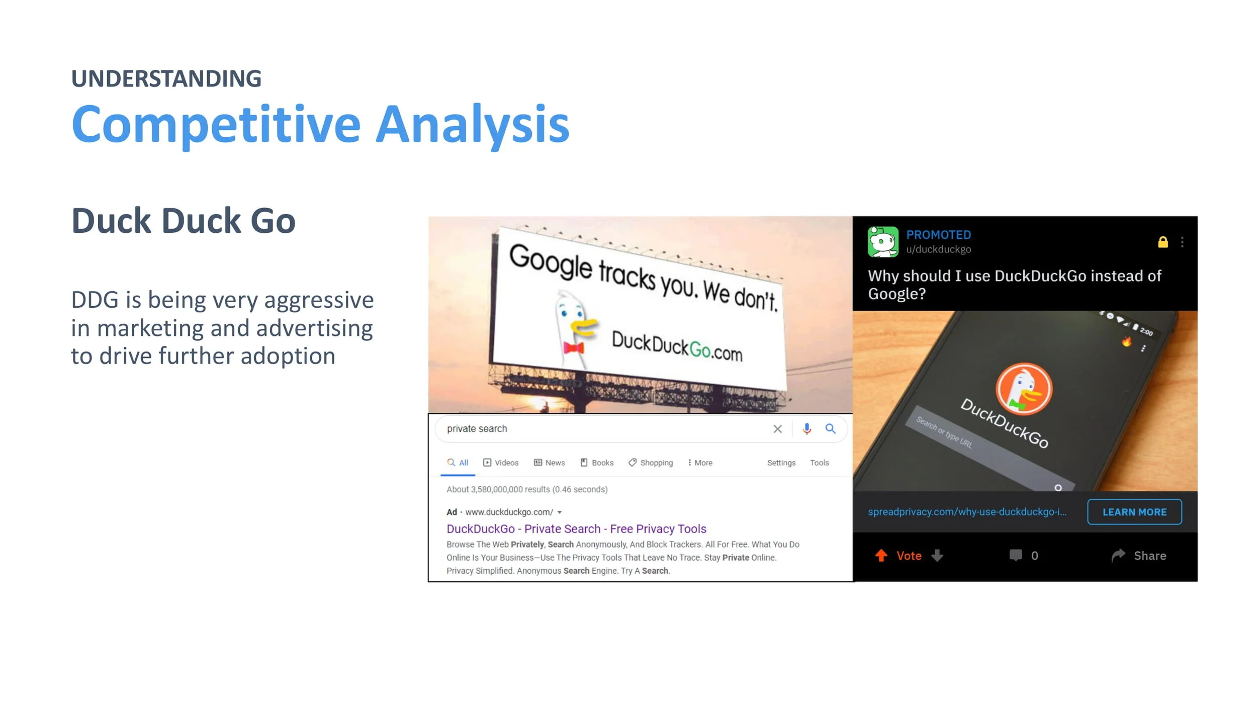
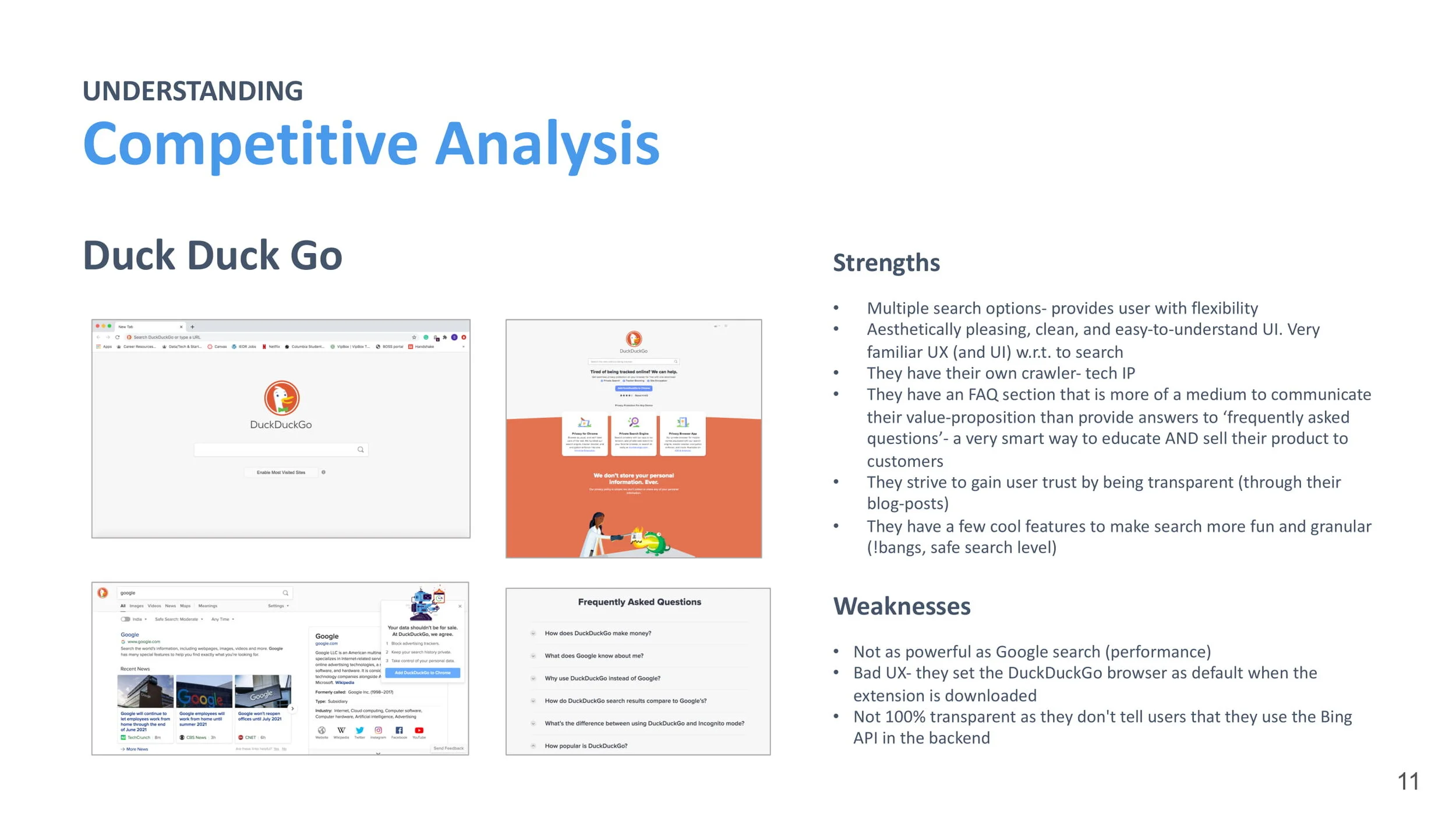
D E S I G N S P R I N T I
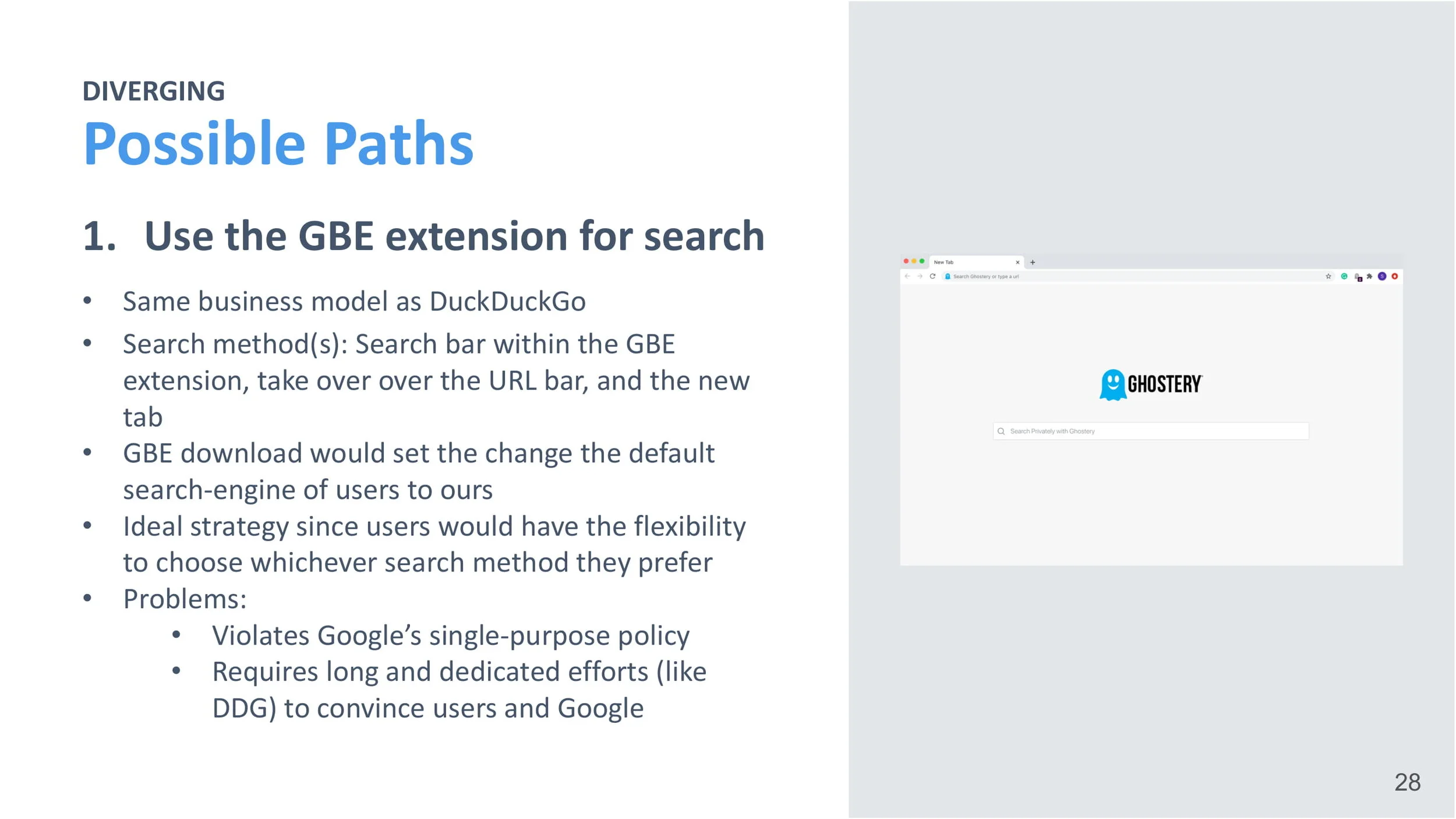
Ghostery Browser Extension
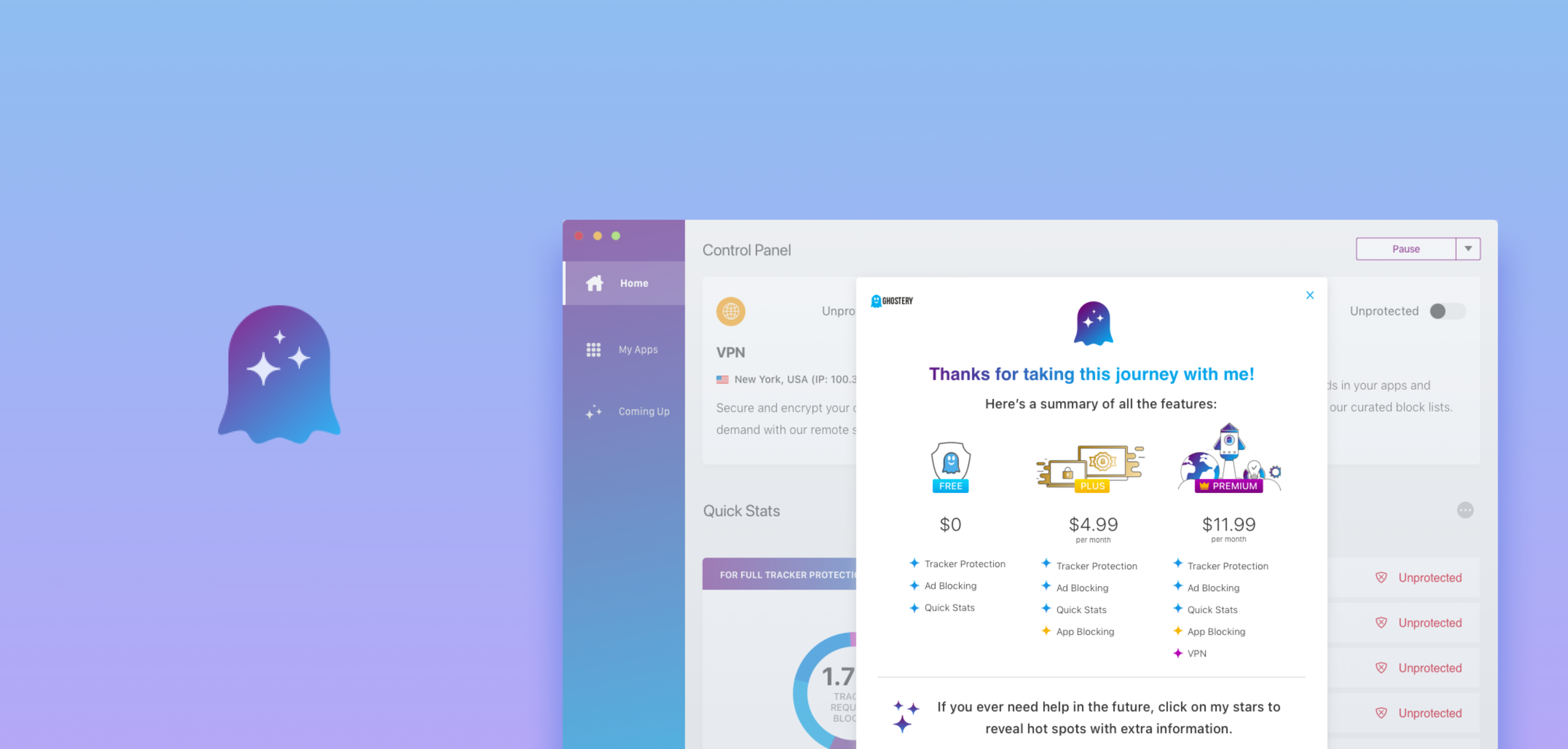
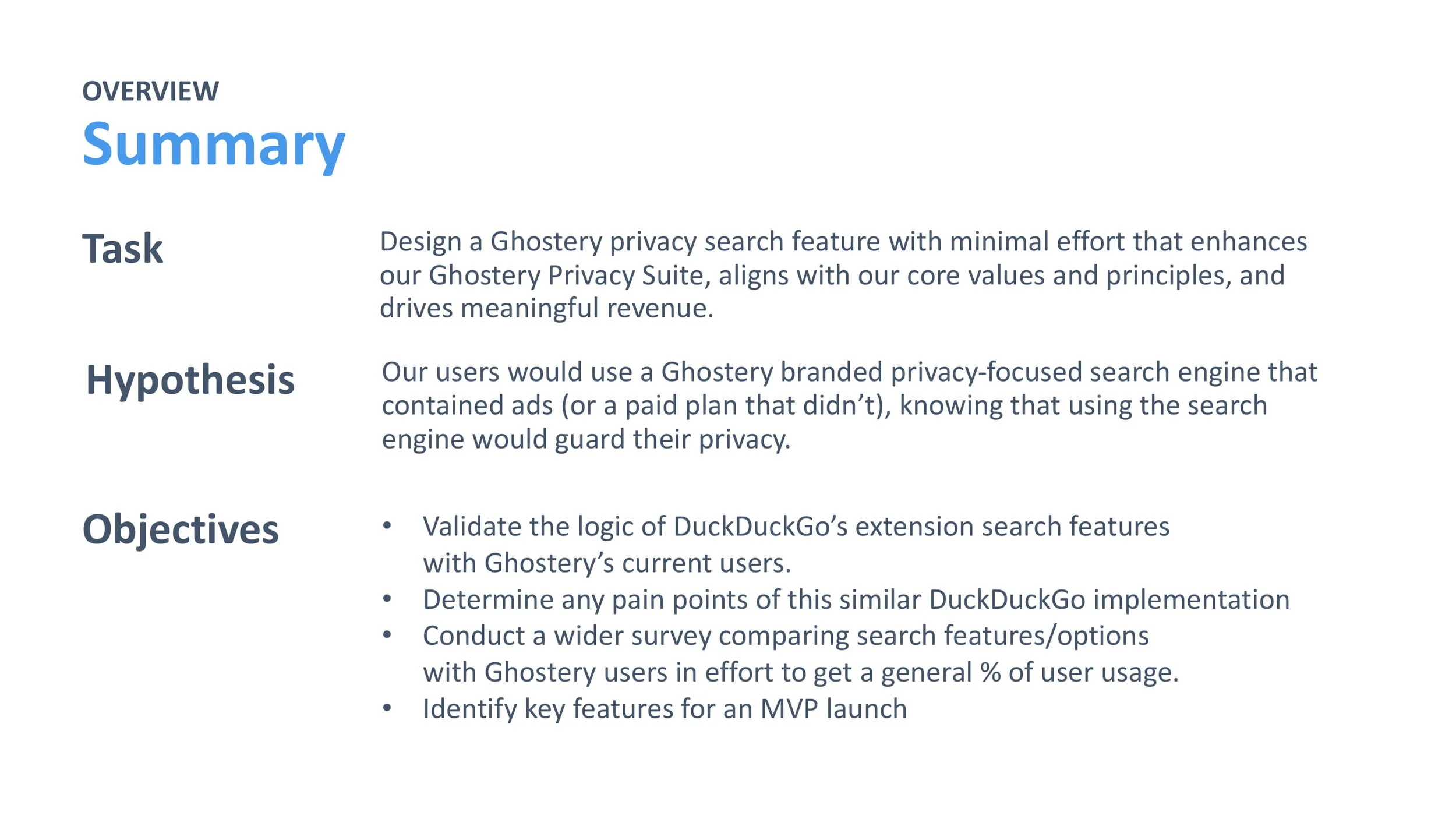
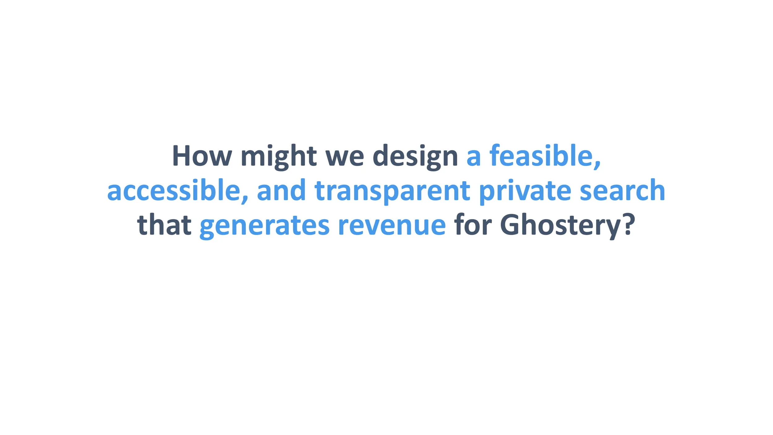
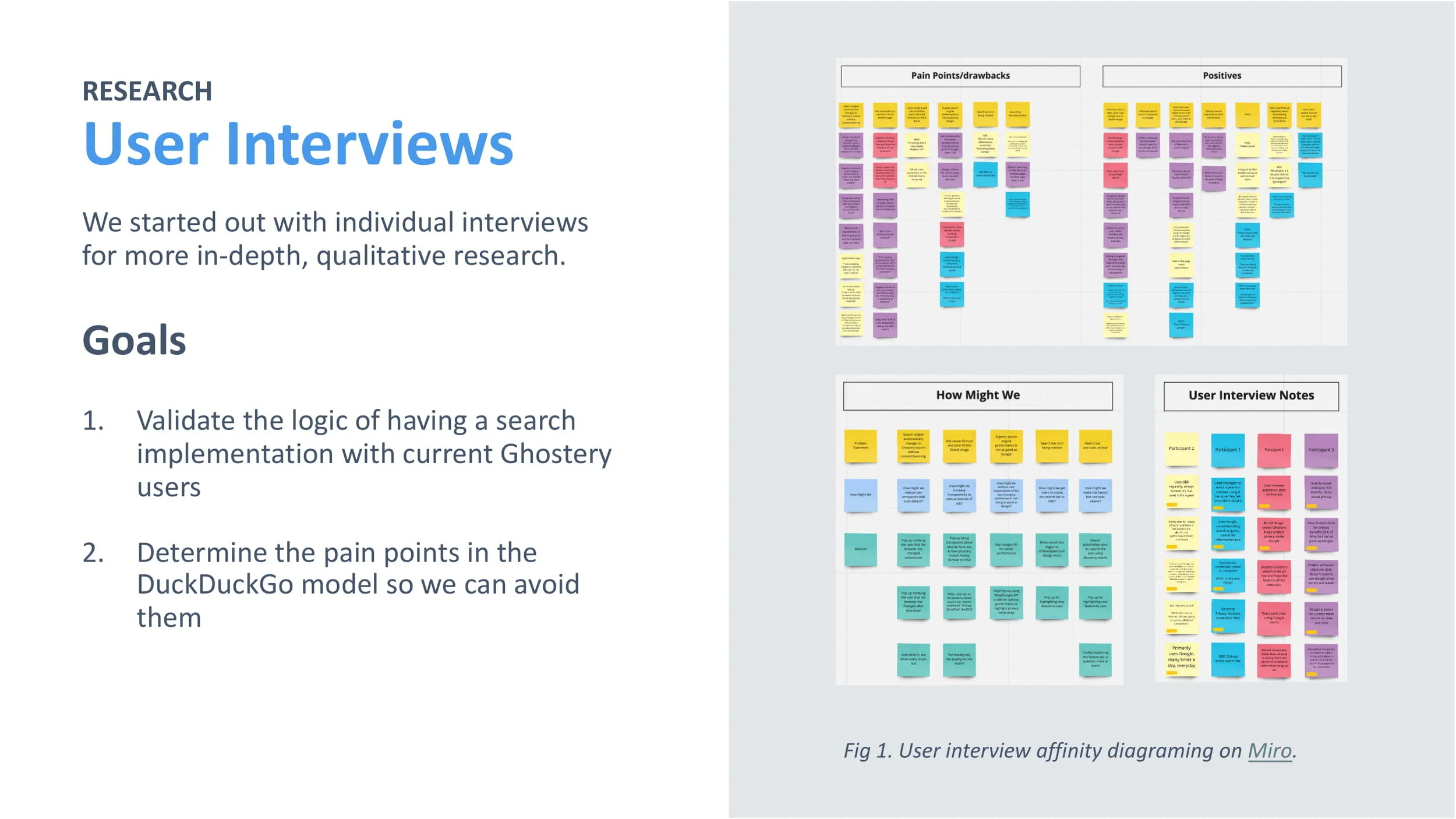
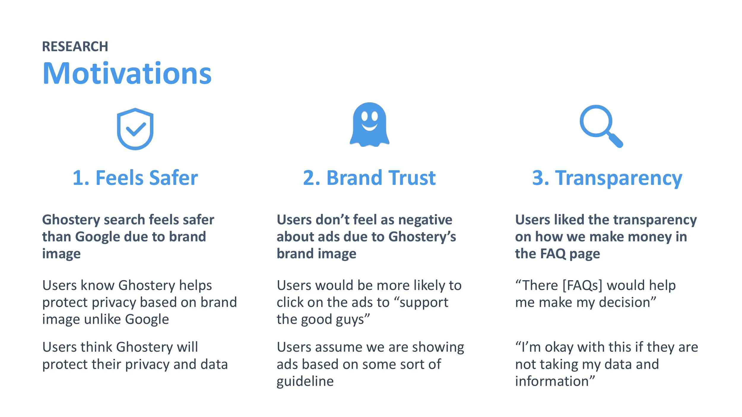
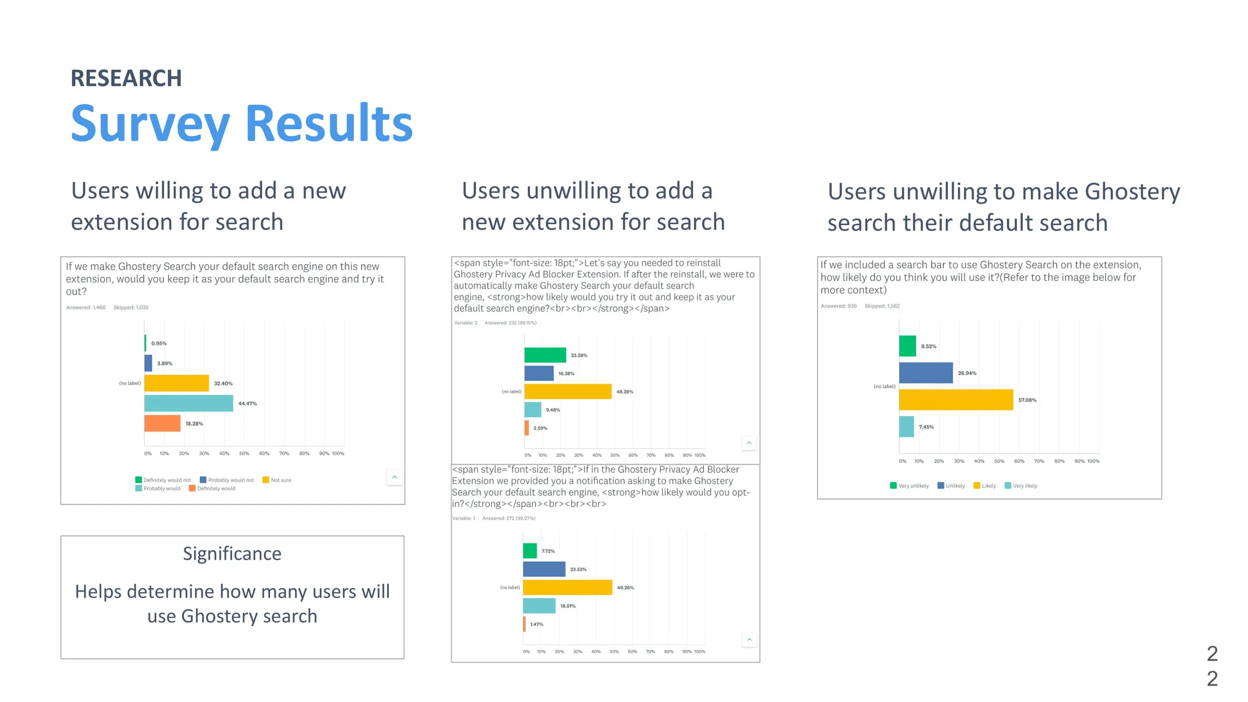
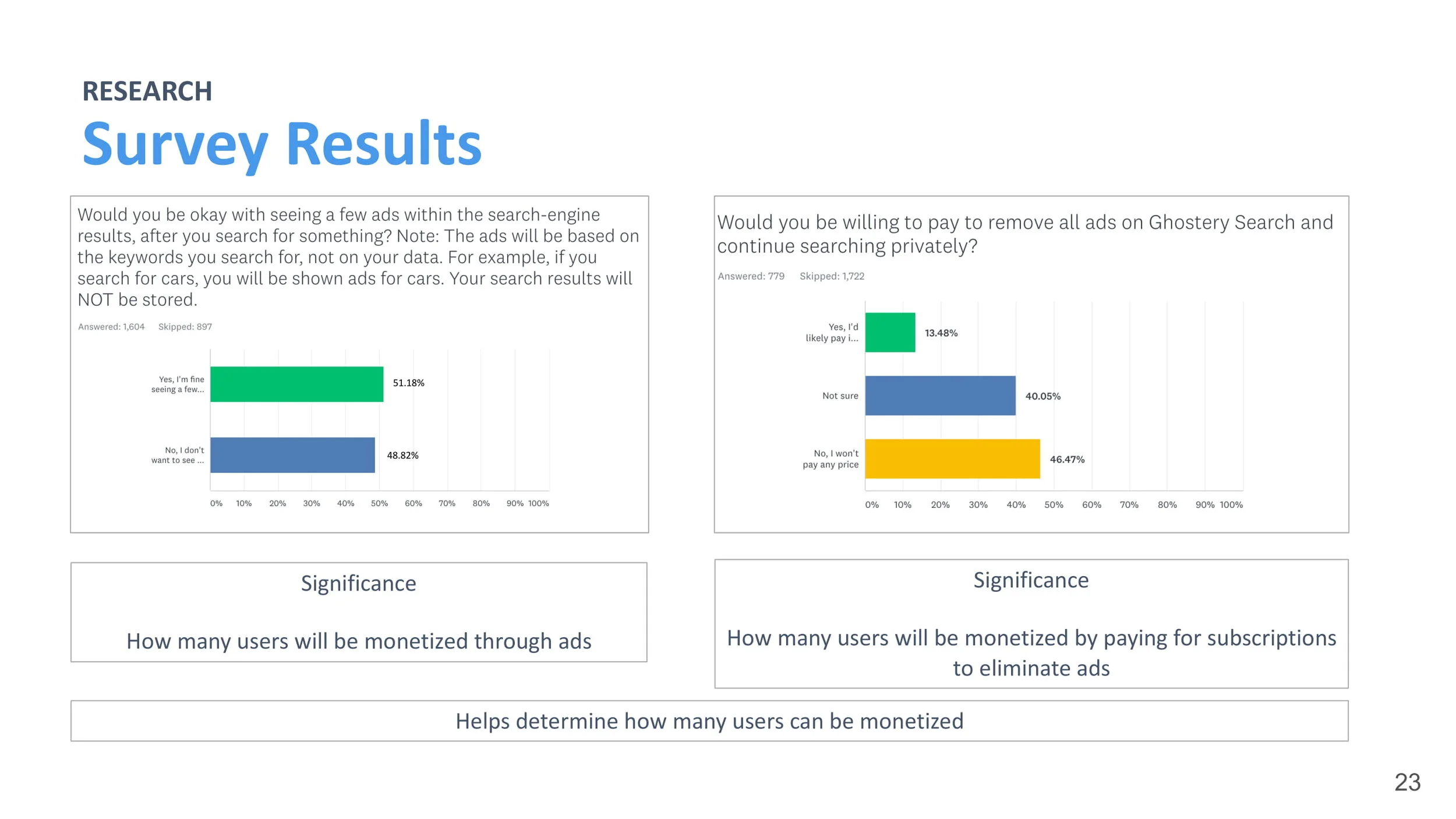
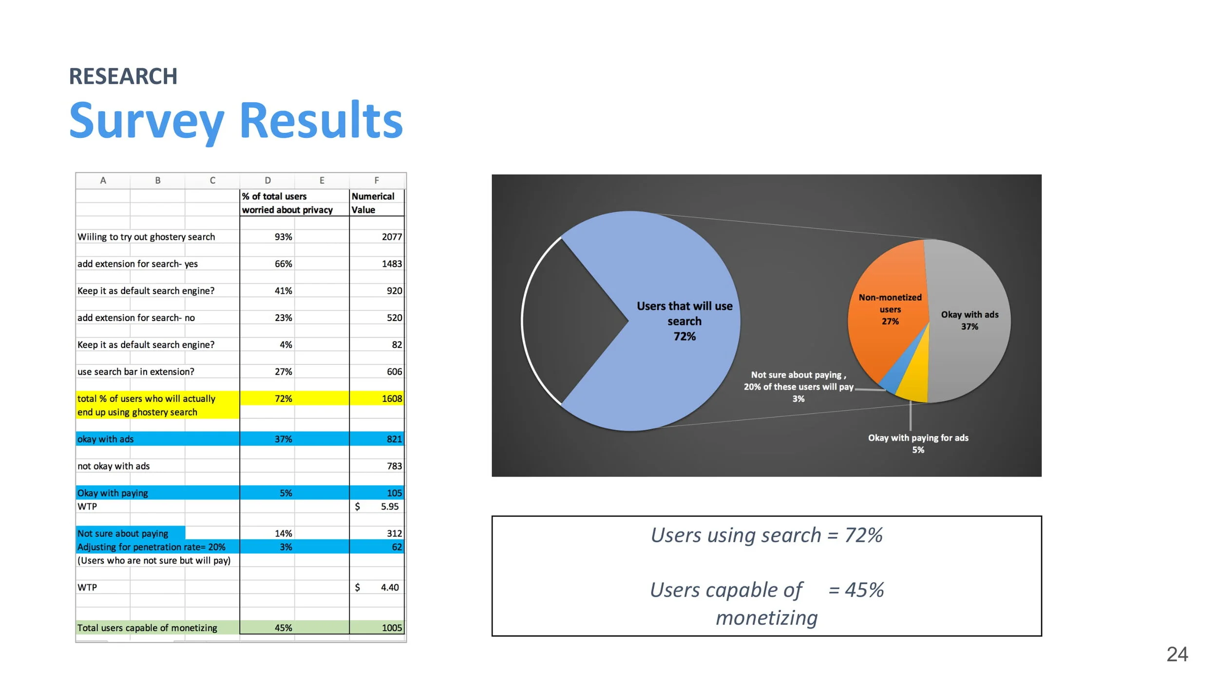
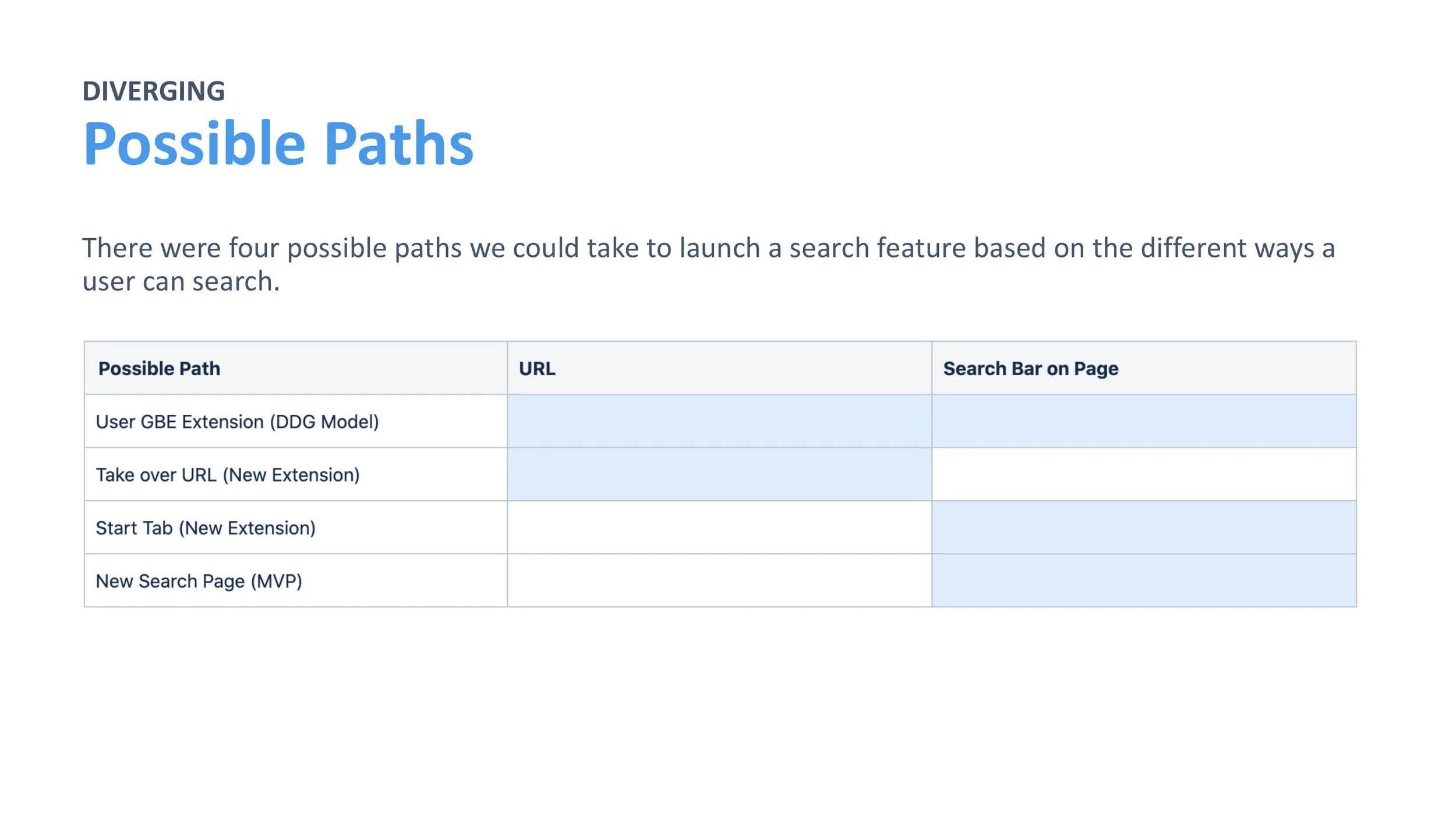
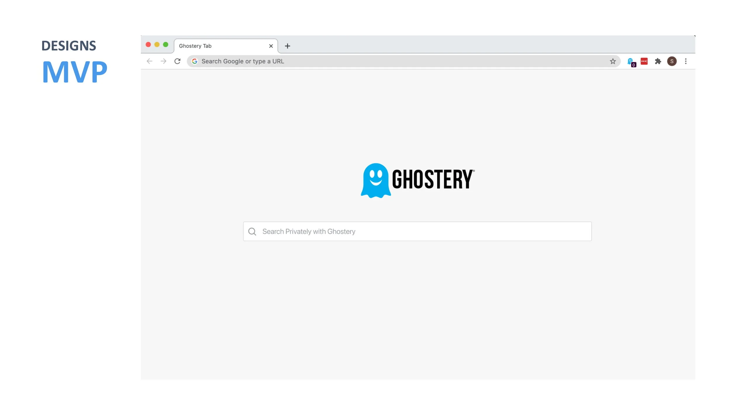
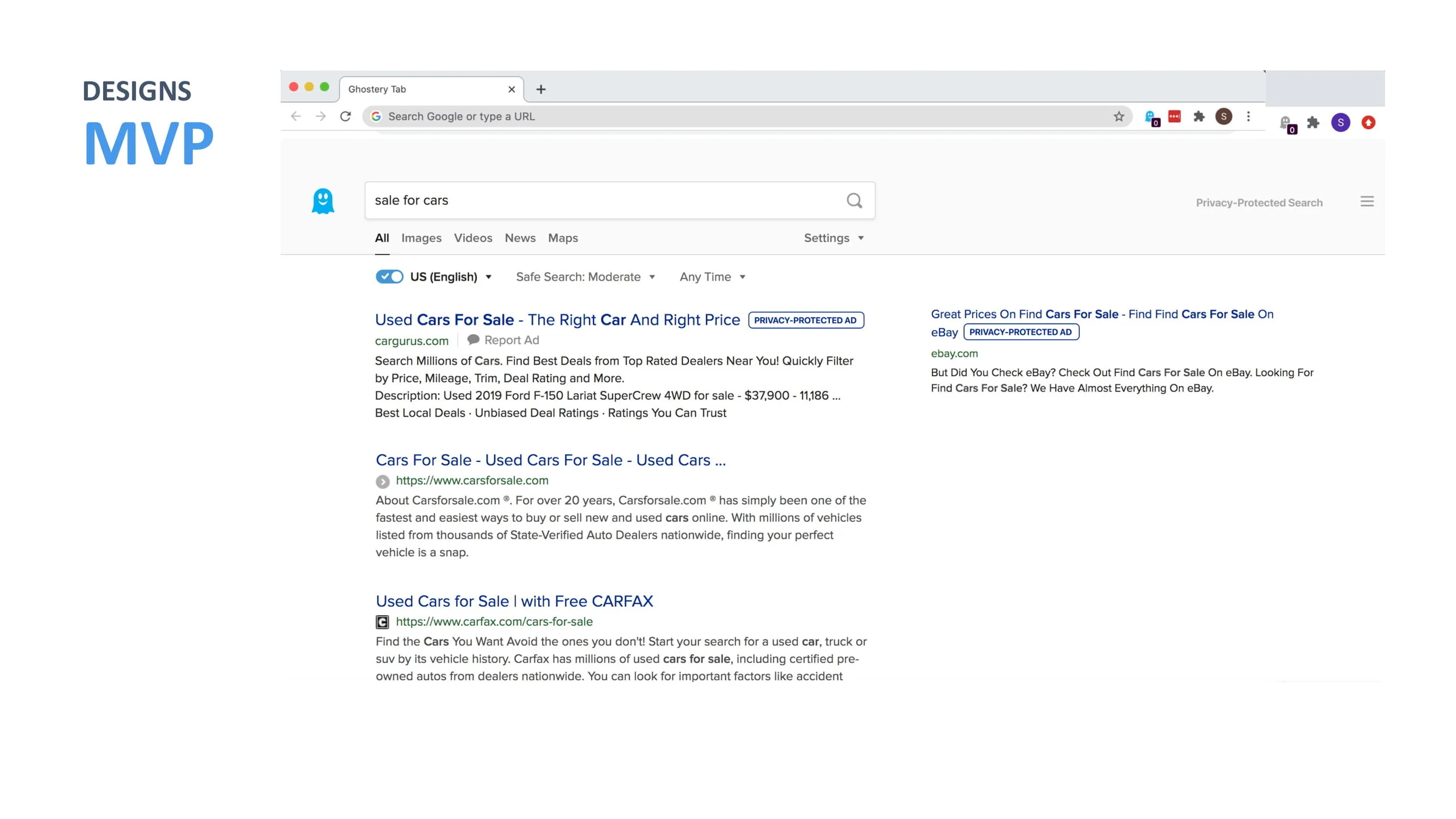
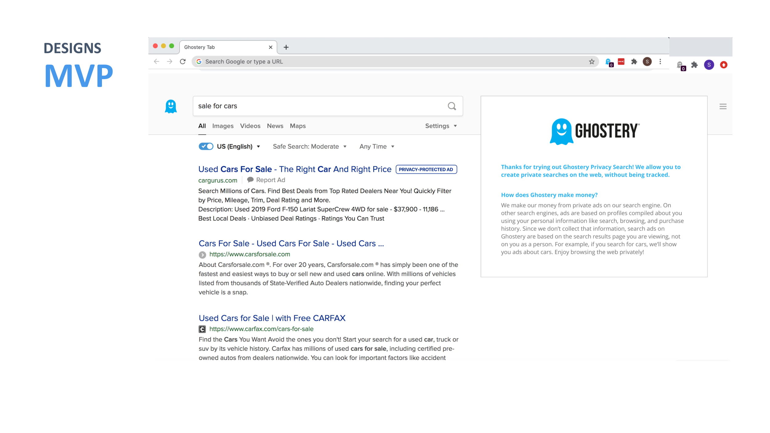
We were tasked with designing a private search engine.
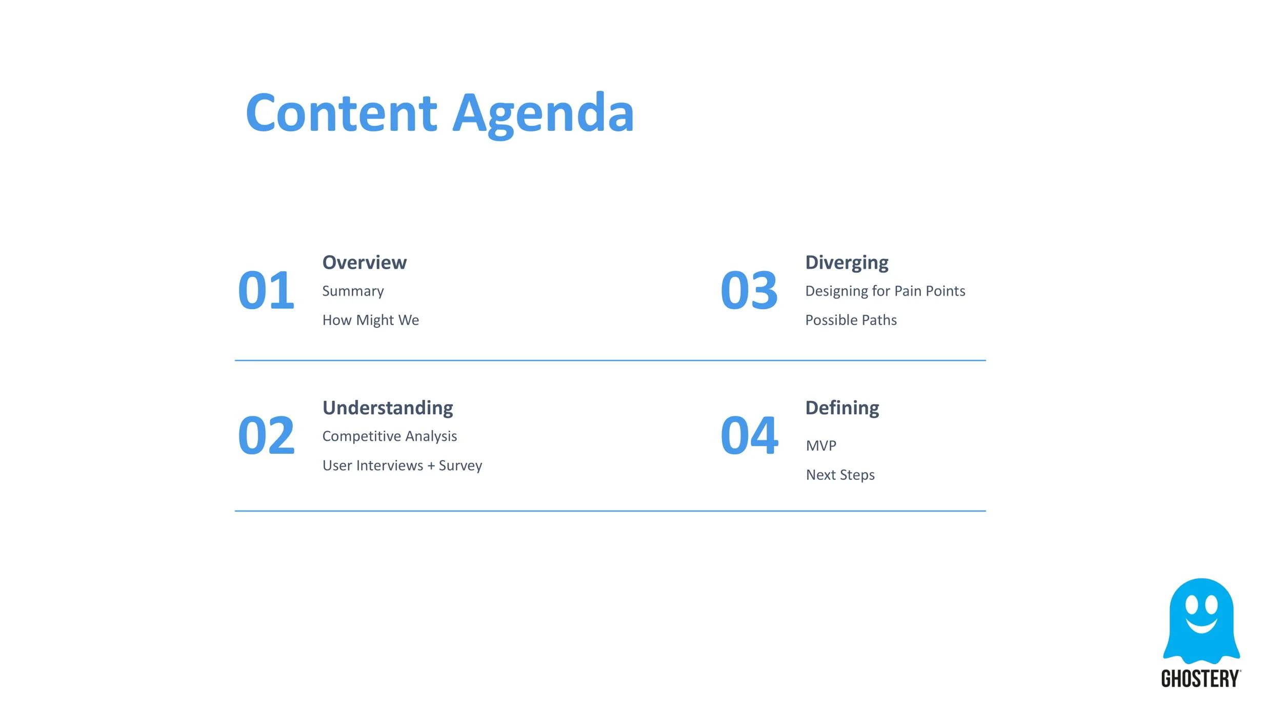
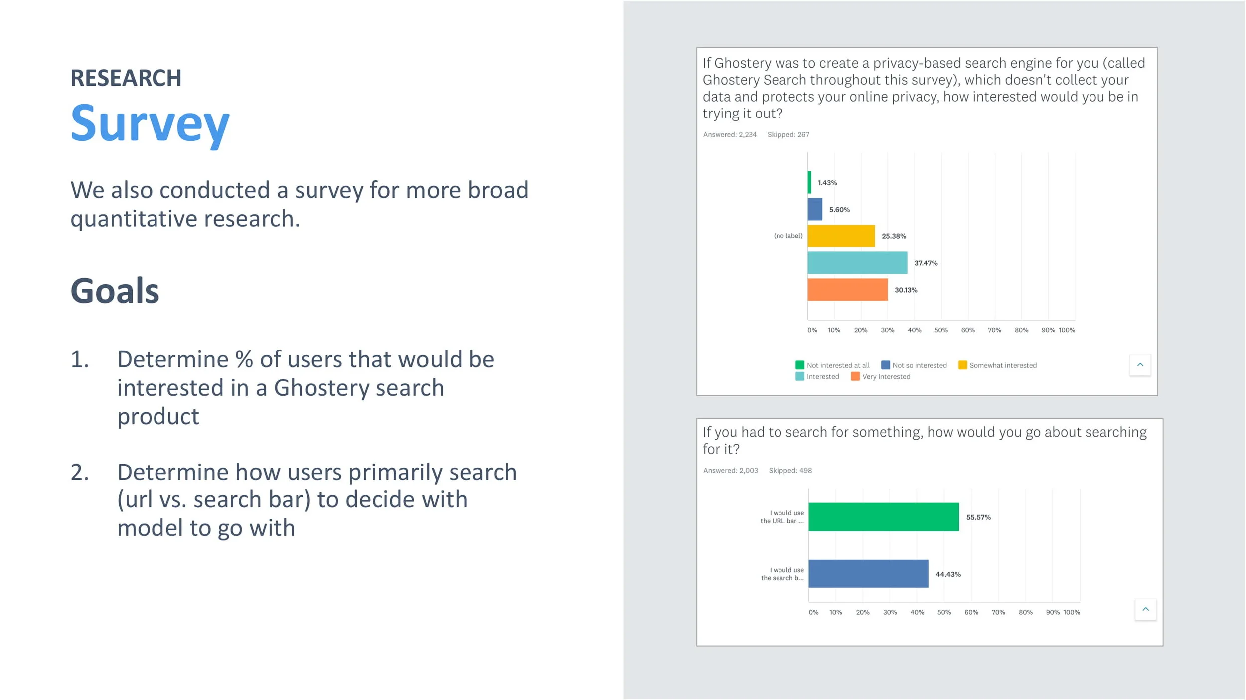
For the capstone project of our internship, we were prompted with designing an MVP for a privacy search feature in the Ghostery Browser Extension, using product thinking to balance engineering constraints, business revenue potential, and user needs. For an overview of our project, please see our final presentation below.


_
D E S I G N S P R I N T I I
Ghostery Umbra Checkout
We were tasked with redesigning the web checkout experience to reduce user abandonment during checkout and ultimately increase conversions.
Problem
The current checkout experience contains a few steps to complete and may contribute to our low conversion rate from free to paid user. Recent changes to our subscription tiers (and a future credit card test we’re looking to run in the future) also adds a couple more steps, adding more length than originally intended.
Hypothesis
Creating a good checkout experience helps improve conversion rate by reducing checkout abandonment rate. Simplifying the checkout page/process (reducing clicks/tabs and removing unnecessary fields) will increase the % of conversions compared to visits, helping improve our conversion rate overall.
P H A S E I : U N D E R S T A N D I N G
Current Checkout Flow
To gain a better understanding of the product and problem space we were trying to solve, we went through the checkout experience, and created a user flow to visually see the current process and identify the pain points.
Strengths
1. Easy to Digest: split into 4 steps
2. User-friendly Navigation: progress bar with 4 steps indicated visually at the top
3. Minimizes Fields to Input: credit card info is all in one box so there is as little typing for the user as possible
4. Clear Pricing Page: compares all the tiers and lists the respective features and prices very clearly so it is easy for the user to upgrade
Pain Points
1. Not Seamless: must leave the desktop app to website to upgrade
2. Not Easily Discoverable: not easy to find an upgrade button both within the Midnight App and on the website
3. No Feedback After Upgrade: a clear distinction after upgrading besides the first welcome screen
4. Many Steps: each extra step creates a possibility for the user to reevaluate their decision to upgrade
Reasons for Abandonment During Ecommerce Checkout
Creating a good checkout experience helps improve conversion rate by reducing checkout abandonment rate, so we first looked at the key pain points for checkout on ecommerce sites.
We first researched best practices for checkout experiences, looking especially at e-commerce, which has many features that can be applied to our own checkout procedure. Below are some of the key findings we discovered.
Fig 1. From secondary literature review survey with 4,500 adults in the US, we found the reasons for abandonment during checkout were (1) extra costs, (2) having to create an account, (3) a long checkout process, and (4) not being able to calculate order cost upfront.
Competitive Analysis of Checkout Process
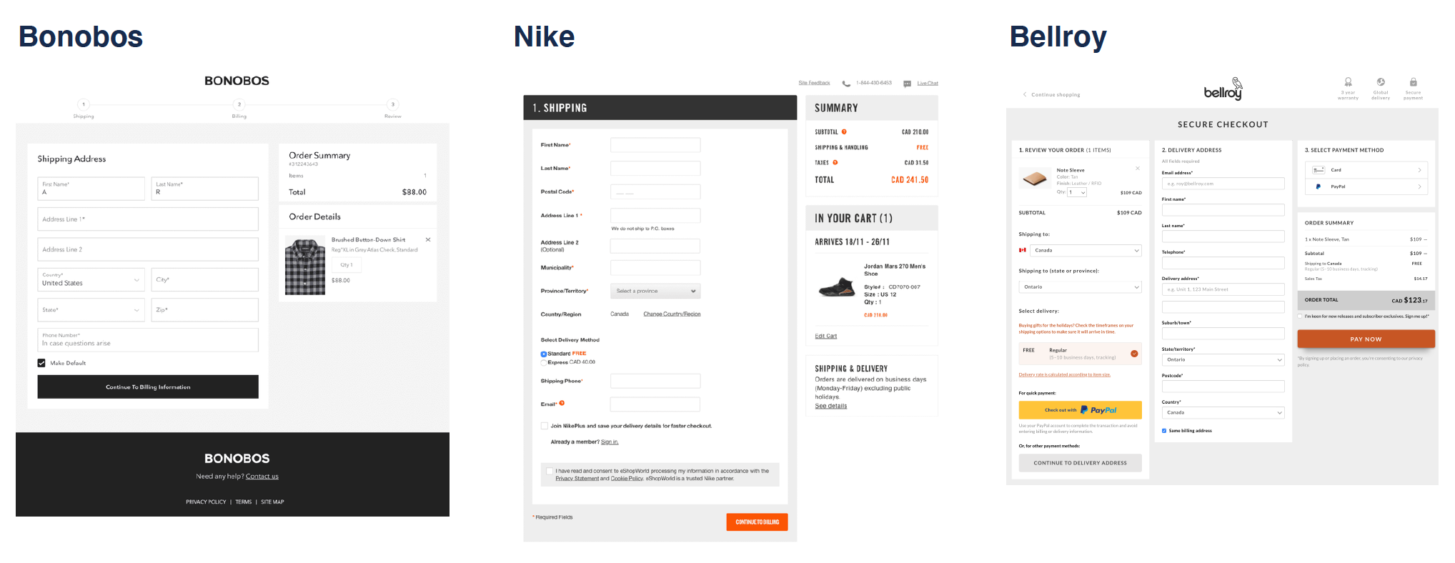
We found that most competitors display all the entire checkout experience on one page, with two columns - one for the product that you are buying with the price, and the other for the payment details.
We then did a competitive analysis of the checkout process for other VPN/security platforms and ecommerce sites, to discover the key trends and best practices currently being used.


P H A S E I I : D E S I G N I N G
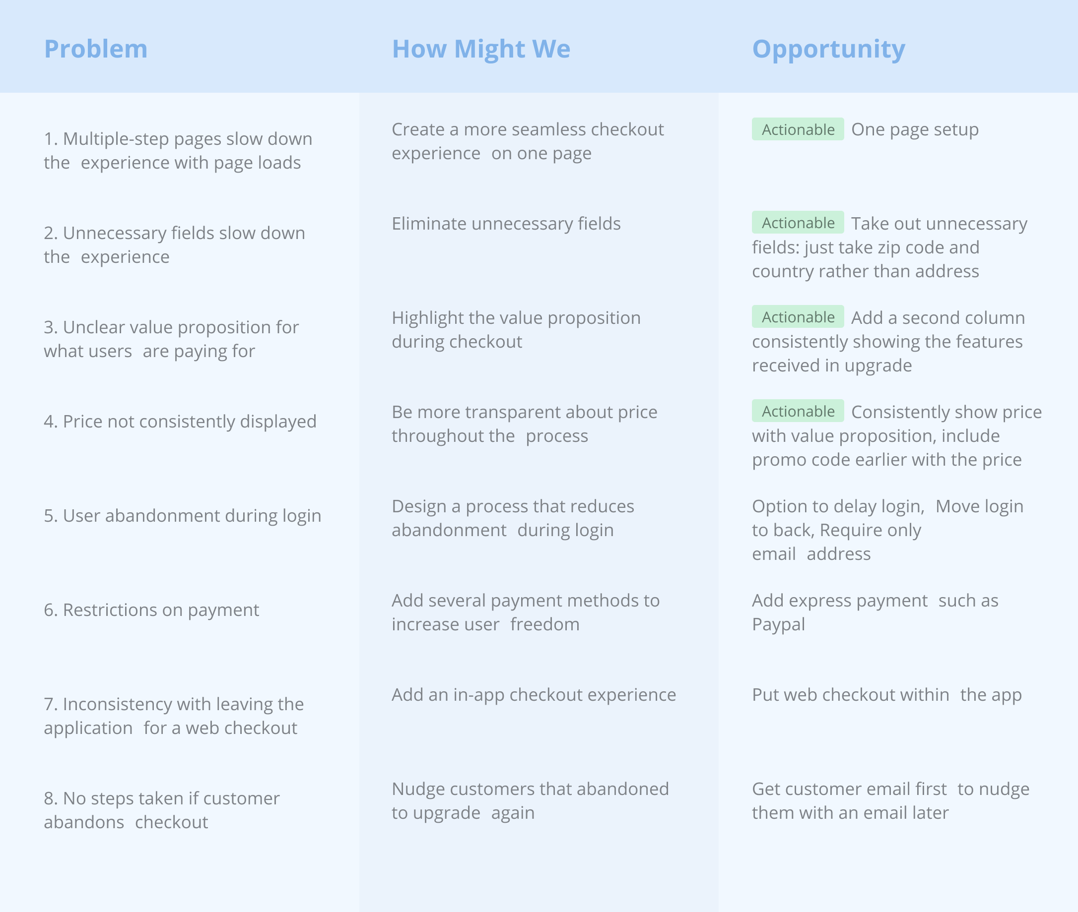
Problem Statement
Users are abandoning the checkout experience which is leading to a reduction in potential conversion.
We defined a problem statement to clearly understand the pain points we wanted to design for. We then created a set of HMW questions for each pain point to frame our ideation process to align with the core insights and user needs we found through our research. We then ideated on actionable steps to answer our HMW questions and solve the pain points we identified.
Ideating
We came up with two possible checkout flows, both of which address the pain points we found by eliminating unnecessary fields, highlighting the value proposition, and consistently displaying the price. From our analysis of best checkout practices, we decided to create a two-column format, with one column containing the payment details and the other containing the information and price about the product.
Additionally, we decided to design for the first four ACTIONABLE pain points first, to create designs that the engineering team would be able to immediately implement. Additionally, we wanted to validate our assumptions about major features we wanted to implement before designing for them.
2. Two Page Checkout
Separate the login process more clearly
More error friendly if the user messes up during the login
Doesn’t overwhelm the user with information at each step
User: “This feels more secure”
1. One Page Checkout
More common practice
More seamless, fast process with everything displayed at
once
Works better if you just need the email rather than having to
login/signup
User: “If I make an error, then wouldn’t I have to fill out the whole page again?”
Prototyping
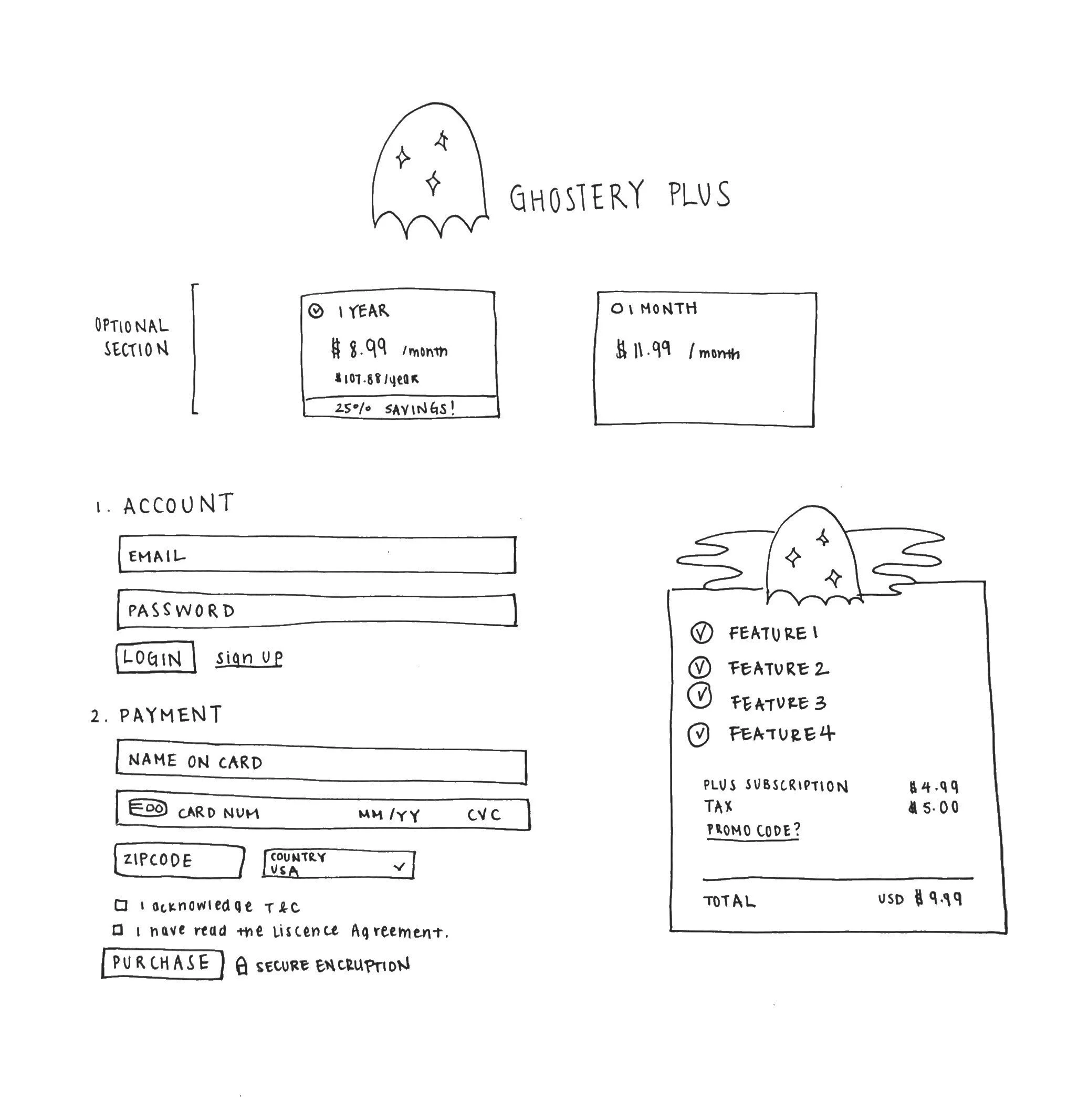
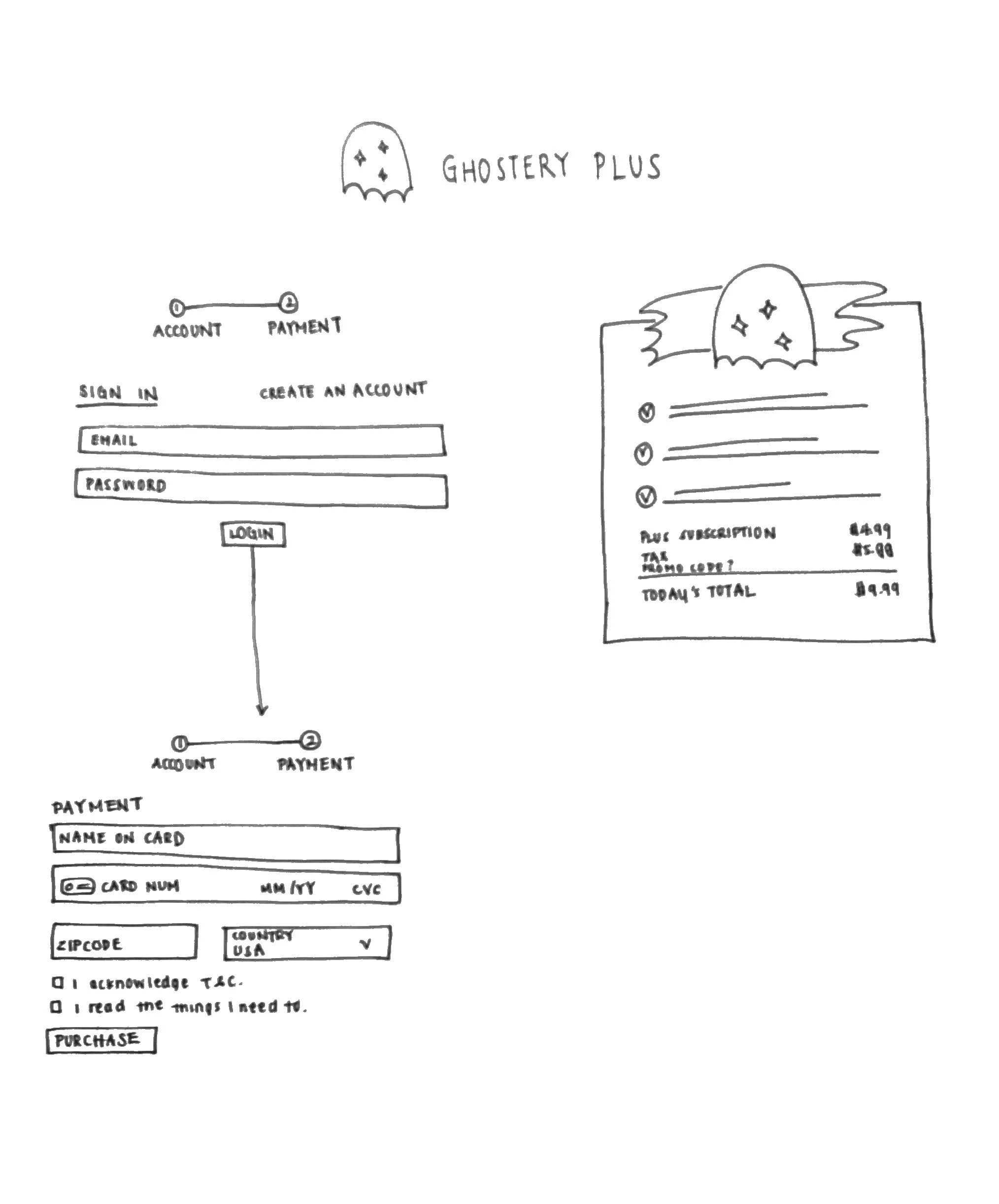
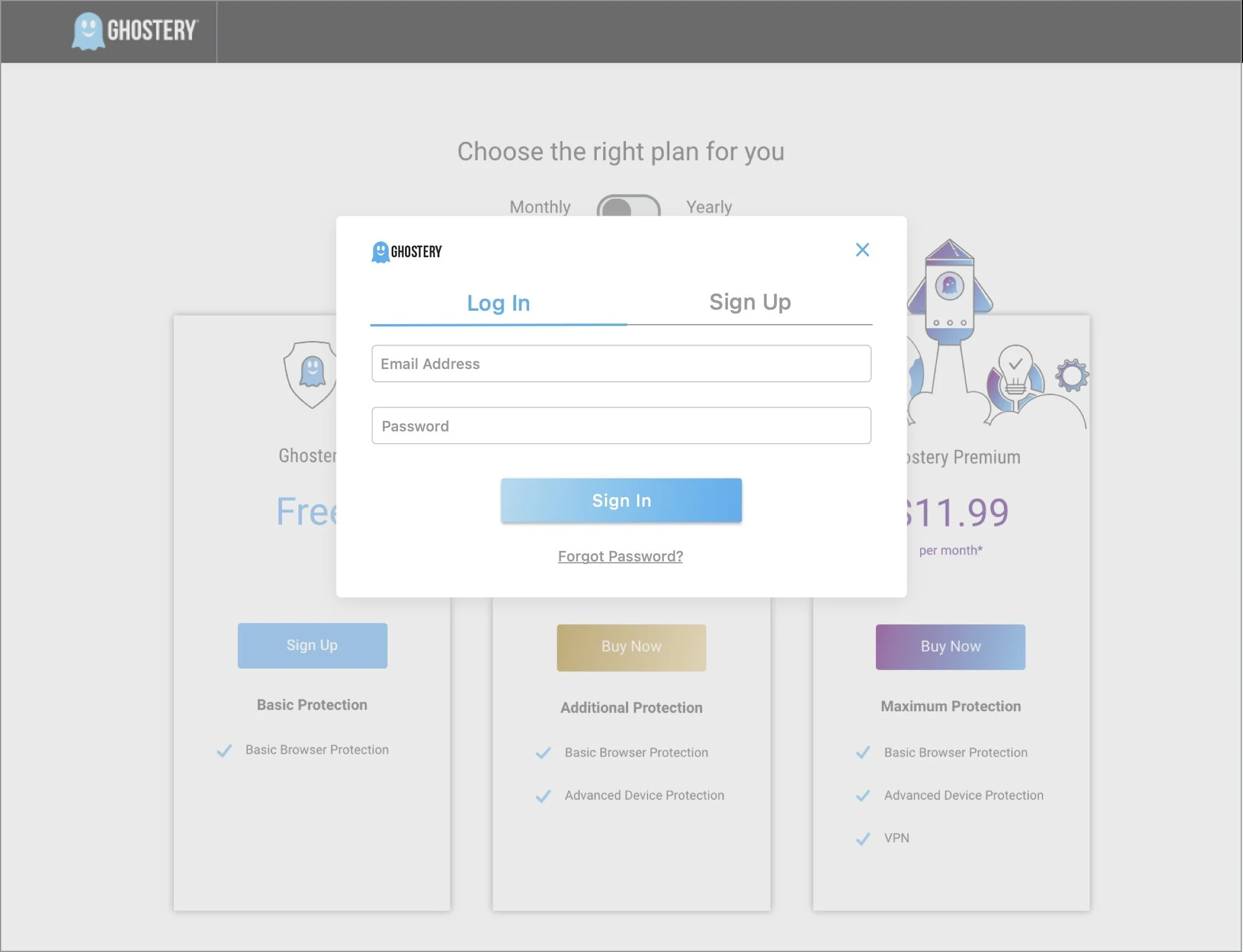
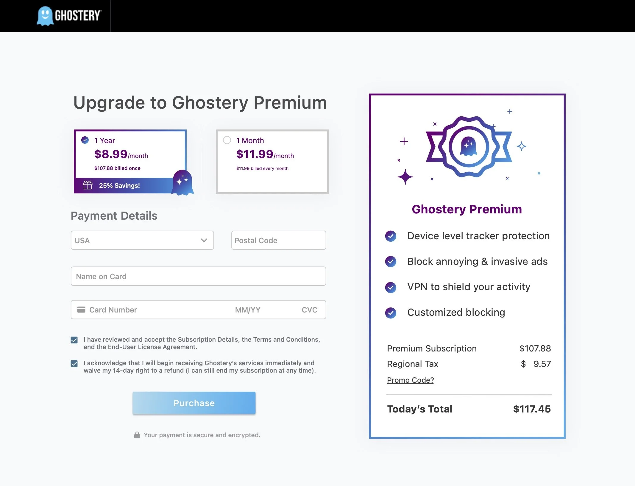
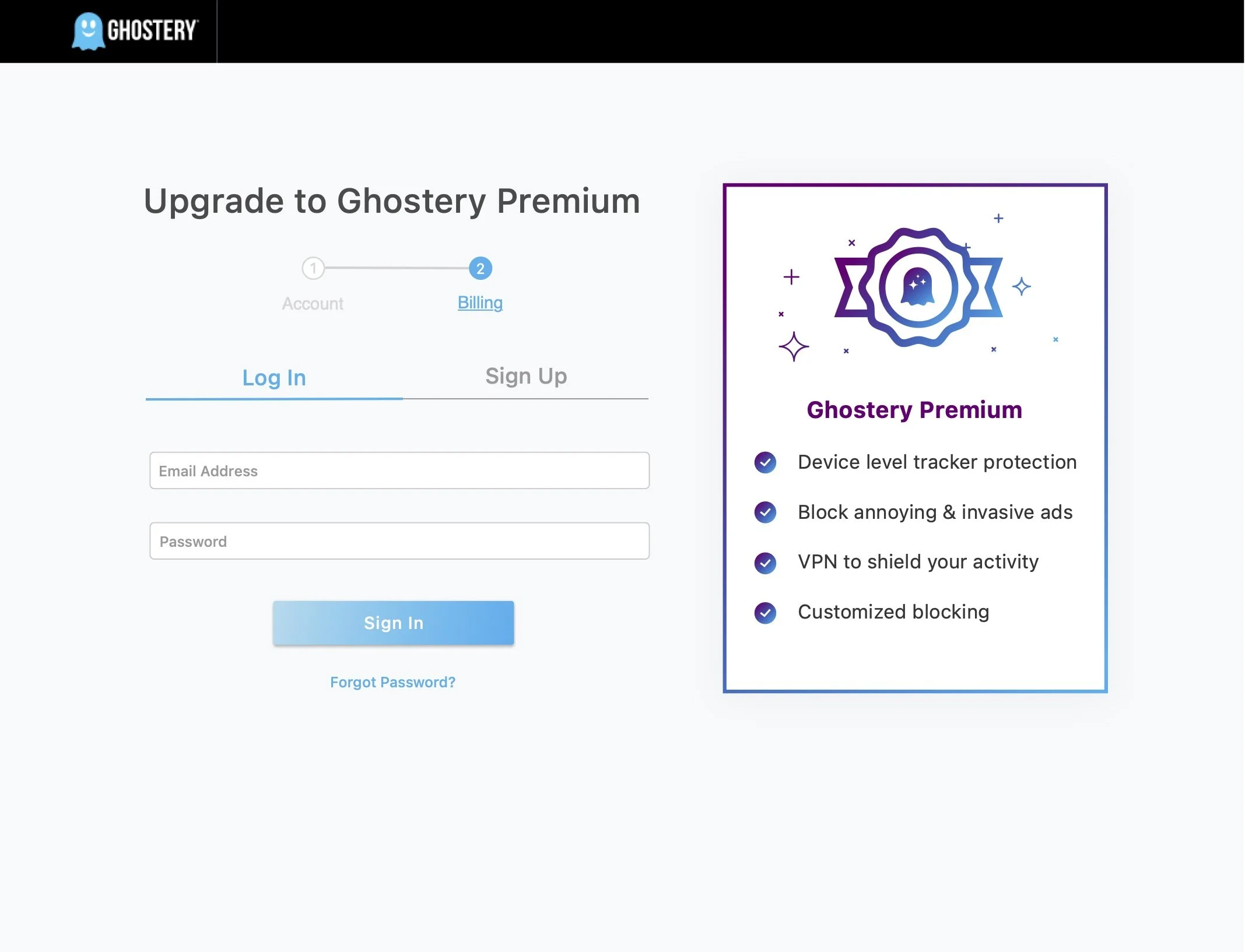
We created two possible designs that we thought of for a twostep login: (1) a modal login and 1-step checkout page and (2) a 2-step checkout page, which is just a simplification of the four-step flow we currently have.
In Sketch, we created two high-fidelity onboarding experiences based on our paper prototypes. Since we wanted to validate our assumptions on the current checkout process as well, we decided that we would only show users the modal login so that we wouldn’t overwhelm them with information. This would provide us with information on how the modal compares to the multi-page process that that current process has. To see the full interactive prototypes, please see our Framer Prototype.
1. Modal Login & 1-Step Checkout Page
2. 2-Step Checkout

P H A S E I I I : T E S T I N G
User Testing
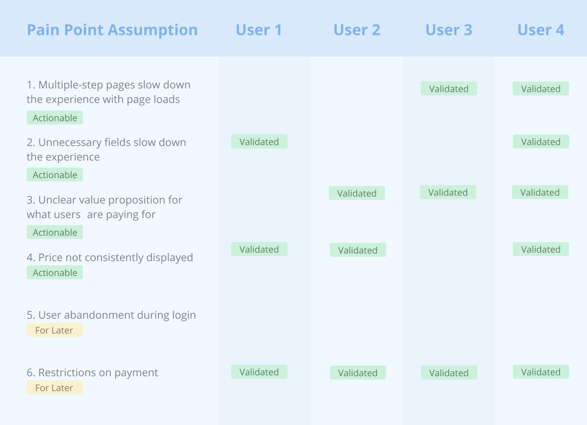
We conducted four user interviews, with the main goals of (1) validating the pain points we identified in the current checkout process and (2) determining if our redesigned checkout experience solves that first four ACTIONABLE pain points. We used both qualitative and quantitative testing methods by taking the user through contextual walkthroughs of our designs, and by sending them quantifiable surveys. We ultimately found that:
All of our four ACTIONABLE assumptions were validated by our users, combining the experience on one page, taking out unnecessary fields, displaying the value proposition they are paying for more clearly, and consistently showing the price. As such, we will keep these features for our next iteration of designs.
Users consistently commented and verified our FOR LATER assumption on the restrictions of payment, and suggested including multiple payments such as Paypal. We would be interested in weighing the cost vs benefit of adding this implementation with the engineering team.
Users did NOT validate our FOR LATER assumption that there would be user abandonment during login. Since they did not find issues with the login, there is no need to design for this feature right now.
P H A S E I V : R E F L E C T I N G
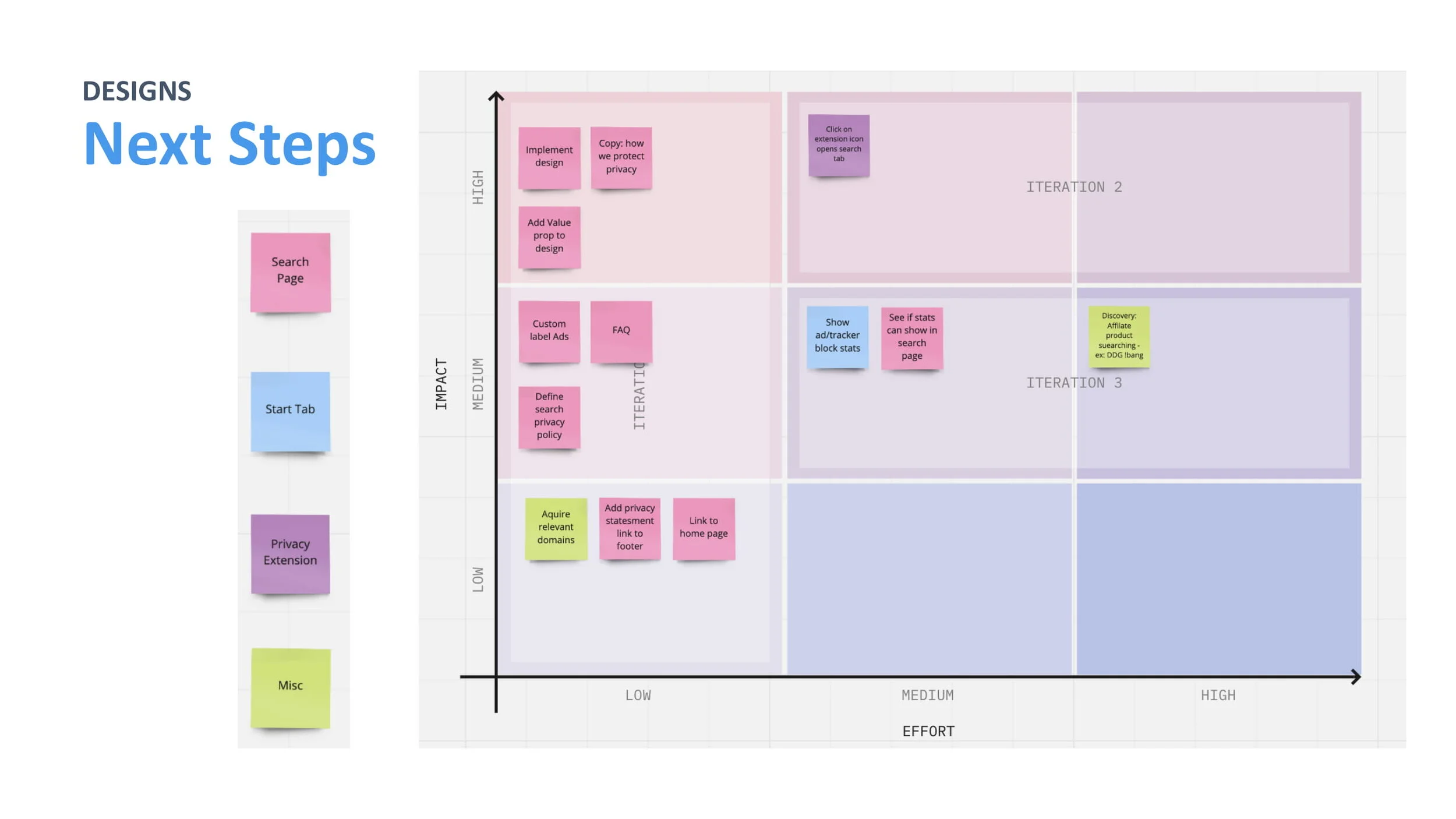
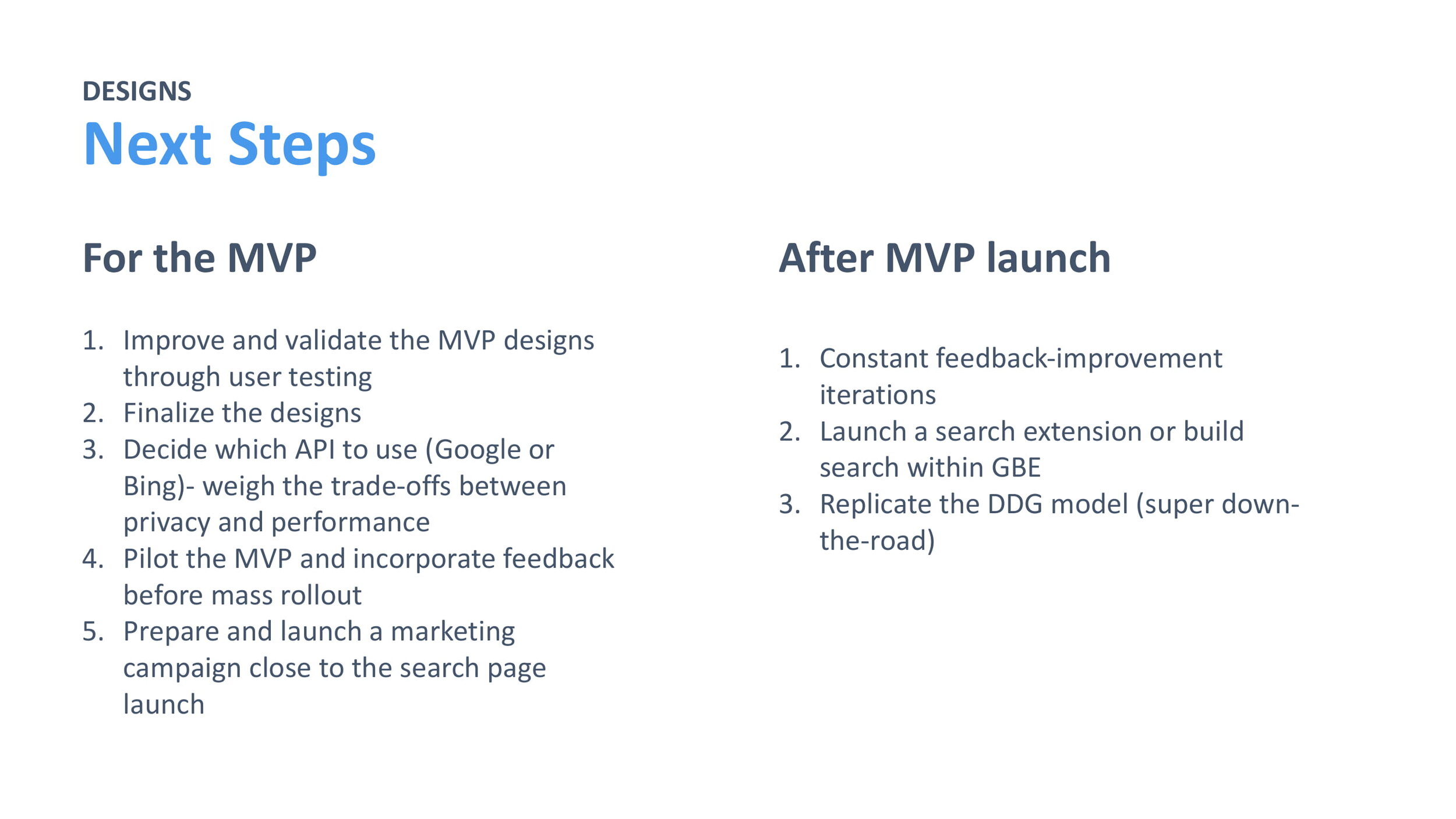
Next Steps
Generally, we found that our users responded positively to our new design, commenting that it was a faster and more streamlined experience. However, there were still pain points they pointed out during our user testing. We made a list of steps to take to address these additional pain points in a future iteration of designs. We’ve split them into minor UI changes and major features to clearly separate the actionable items from more time consuming ones that we would like to do further research on first.
2. Major Features (For Later)
Several payment methods such as Paypal (if 50% conversions are being lost due to the current payment system)
Highlighting and clarifying value proposition
1. Minor UI Changes (Actionable)
Recurring billing cycle dates should be mentioned clearly for both yearly and monthly
Adding a support team
Explain what regional tax is or simplifying to tax
Clarify 14-day to refund to be more transparent
Lessons Learned
Don’t get attached to your designs, and put your ego aside. I noticed that I started to feel defensive when hearing feedback on my designs, and really wanted to hear positive feedback from the user. When I noticed this, I took a step back to remind myself that the designs are not a personal reflection on myself, and was able to more readily take feedback from my peers and the users.
Always validate your assumptions first with users. We originally had set out to design for a better login experience under the assumption that users were abandoning checkout due to the login process, which we found we true from an ecommerce competitive analysis. However, by taking a step back and deciding to validate this assumption first before designing for it, we saved ourselves a lot of time because users did not verify this assumption in our user testing.
Be mindful of restraints from the engineering and business team. At first, we created a list of possible additions that would solve pain points we found such as adding several payments or creating an in-app checkout experience, without considering the cost on the engineering side. It was important for us to recognize and speak across teams to determine which features could be implemented with the least cost and highest reward. Thus, we worked by separating our actionable items from items that were more costly and time-consuming to ensure realistic, quick benefits from this design sprint.
Thank you for reading about my internship at Ghostery! ✨