COSTCO
Transforming Costco’s mobile navigation into a seamless extension of the warehouse experience
Redesigned the app’s navigation and information architecture to surface high-value member actions, unlock more homepage engagement, and support $35MM in incremental revenue within six months.
TEAM
Sharon Jia, Michael Benning, Joanna Tsai, Ainsley Ramirez, Naumita Perez
TIMELINE
1 year
MY ROLE
IA, Interaction Design, Prototyping, Usability Testing
PROBLEM SPACE
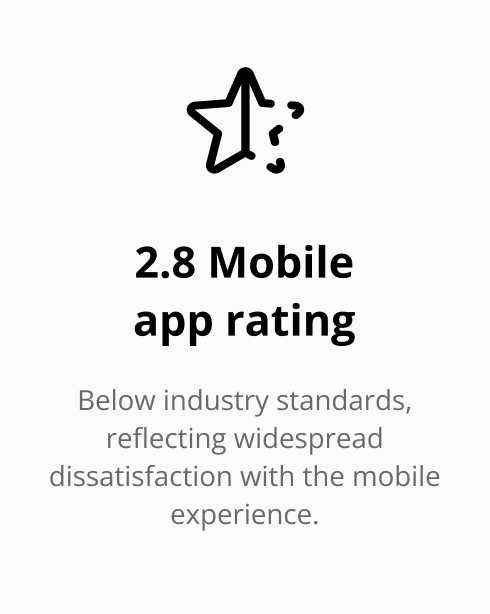
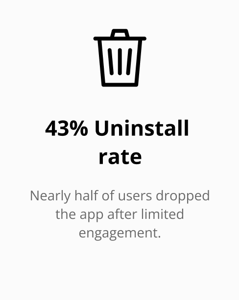
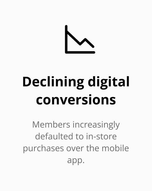
Costco’s mobile app was failing to match the quality of its in-warehouse experience.
Costco members love the store and its brand, but they resent the app. Costco’s in-warehouse experience is trusted and beloved, but the mobile app struggled to meet modern digital standards. Members reported confusing navigation, inconsistent experiences across services, and difficulty finding key actions.
SOLUTION
We redesigned Costco’s mobile experience to be simpler, more consistent, and more member-centered.
We partnered with Costco to improve navigation clarity, personalization, and design consistency across the mobile app. My role focused on restructuring the navigation and information architecture to make key actions easier to find while freeing up space for content and engagement. We aimed to surface high-value actions, reduce navigation friction, improve access to the digital membership card, and increase screen space for campaigns and discovery.
INSIGHT
Research revealed fragmented navigation made key actions difficult to find, so we redesigned the system to prioritize high-value behaviors.
Research showed members struggled to find key actions. Testing with 1,200+ members across 350 sessions revealed that high-value actions — Shop, Cart, Inbox, and the Digital Membership Card — were difficult to locate due to crowded navigation and hidden menus.
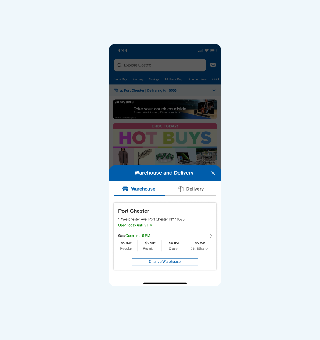
The navigation system was simplified to surface high-value actions and reduce visual clutter. To address this, we restructured the navigation around the most frequent and high-value member behaviors. The Inbox was surfaced in the header to drive conversions, Shop was moved to the tab bar for faster access, and Cart was added to persistent navigation. We also introduced horizontal navigation to improve discoverability. These changes ensured key actions were visible and accessible within one tap.


FINAL DESIGN
Key solutions
Reduced navigation real-estate to allow more space for content
Navigation reduced to allow 69% of screen real estate for content, resulting in higher engagement with campaigns and features.
SOLUTION 2
Surfaced high‑value actions such as inbox, shop, and cart
The Inbox was surfaced in the header due to its highest conversion rates. The Shop was moved to the tab bar, replacing Savings, while the Cart was also moved to the tab bar, replacing the menu. In addition, horizontal scrolling navigation was introduced to improve discoverability across key sections.

SOLUTION 3
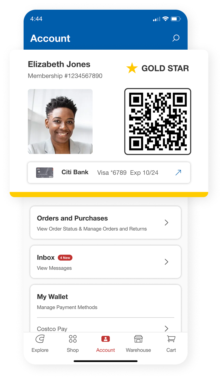
Relocated the digital membership card for easier wayfinding
The digital membership card (DMC) was moved to the Account section to support more predictable way-finding. This change also enabled seamless membership scanning at store entry, improving speed and reducing friction at checkout.
IMPACT
Reducing navigation footprint unlocked more space for content, with 29% more usable real estate.
We redesigned the header and navigation hierarchy to reduce visual clutter and prioritize campaigns, promotions, and product discovery. This increased usable screen real estate and shifted focus toward engagement-driven content. Our navigation changes enabled 29% more usable screen space, with 69% of the screen dedicated to content.


IMPACT
The redesigned membership experience enabled in-store scanning, improving security and supporting revenue protection.
We repositioned the digital membership card within the Account section to create more predictable way-finding and ensure reliable access during in-store entry. This redesign enabled Costco to implement seamless membership scanning at warehouse entrances, reducing friction at checkout while improving enforcement of membership rules. By making membership verification more consistent, Costco was better able to address issues such as family sharing and unauthorized card usage, which had previously contributed to revenue leakage. The improved flow strengthened operational control while maintaining a fast, frictionless member experience at entry.

IMPACT


